Khorayef Testing & Evaluation Center
A specialist identity that turns the idea of verification into a distinctive signature.
The approved logo, the thinking behind its form, and five explorations of what confidence can look like.
Designer
Ali Daoud
Role
Logo design & creative directions
Scope
Identity system & application concepts
Status
Approved logo Applications shown as mockups
The creative question
Testing produces evidence. An identity has a different task: helping people recognize the organisation responsible for that evidence.
For KTEC, the design challenge is to give a technical name a clear, memorable form while keeping a visible relationship with the Alkhorayef brand family.
An assured, methodical presence. The visual language needs to suggest precision without turning the logo into a technical illustration.
It must travel between very different contexts: a building, a report, a staff badge and a screen. The core idea needs to survive each change in scale and material.
A distinctive initial that still reads as part of KTEC.
A palette that carries the parent brand into a specialist setting.
A signature with enough clarity to work beyond a presentation slide.
The approved identity
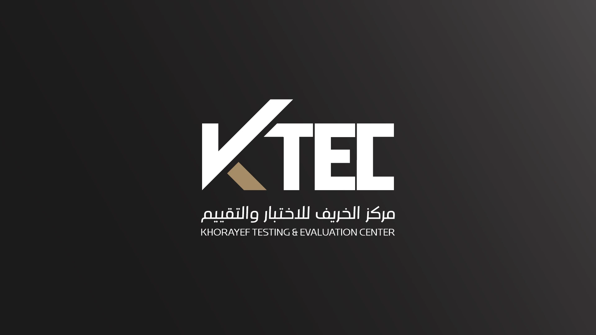
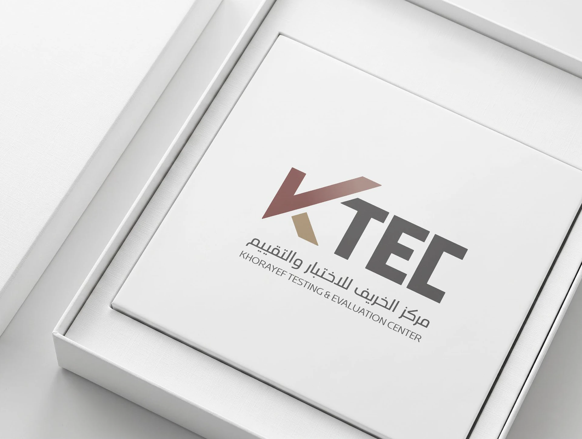
The name and the idea meet in one signature. View the colour and reverse versions, then open either artwork for the original presentation.
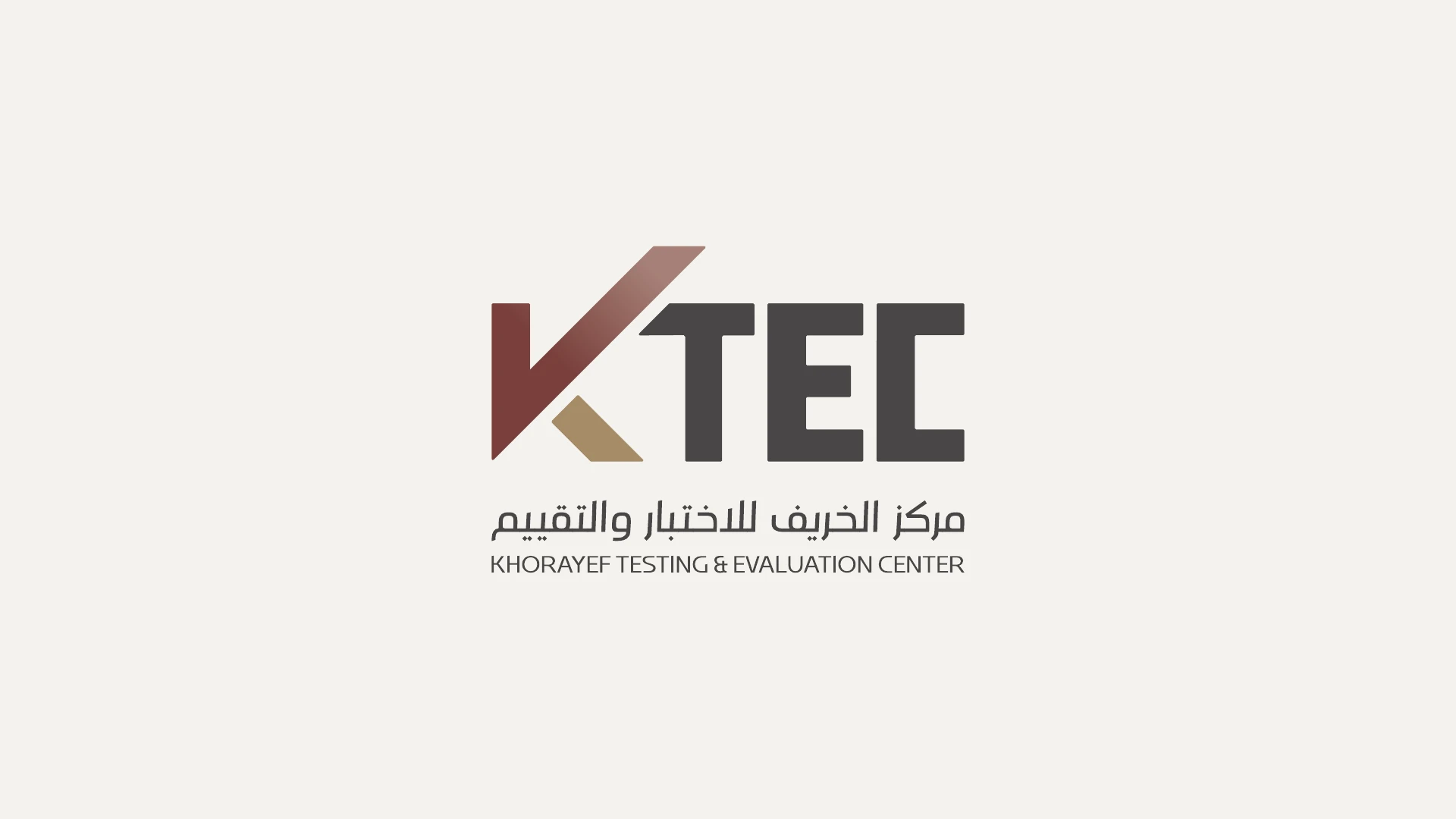
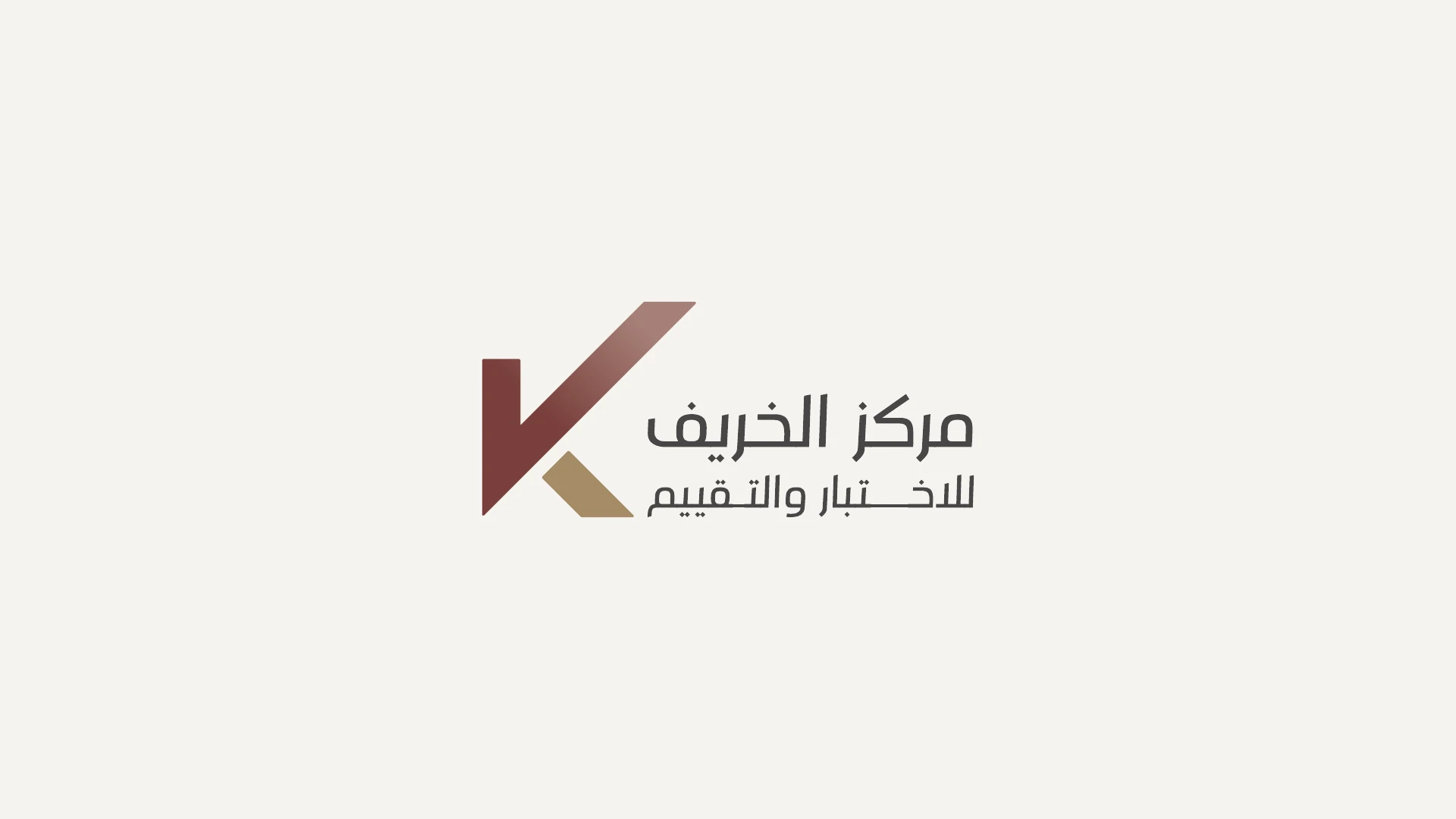
The rising stroke can be read as a check while remaining part of the initial. Recognition and verification share the same form, giving the centre a symbol tied to both its name and its purpose.
The diagonal introduces a decisive gesture. The solid TEC letterforms hold it in place. That contrast gives the identity energy without losing the composure expected from a technical institution.
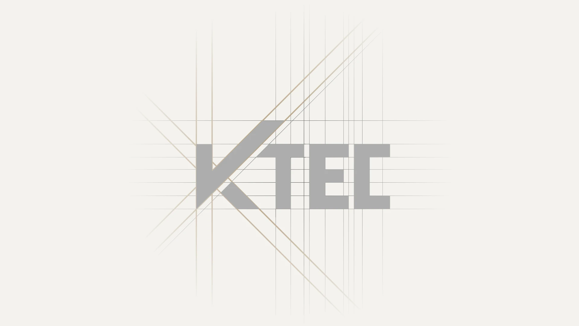
A consistent angle connects the symbol, the cut of the letters and the smaller gold element. The construction drawing makes that relationship visible.
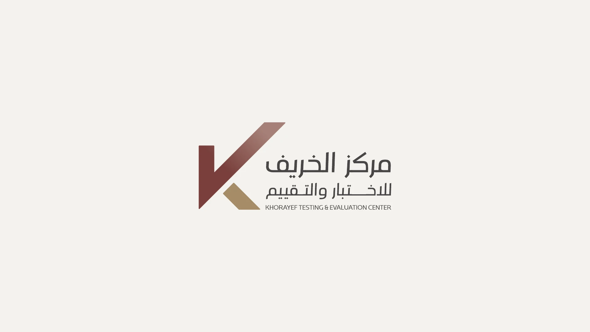
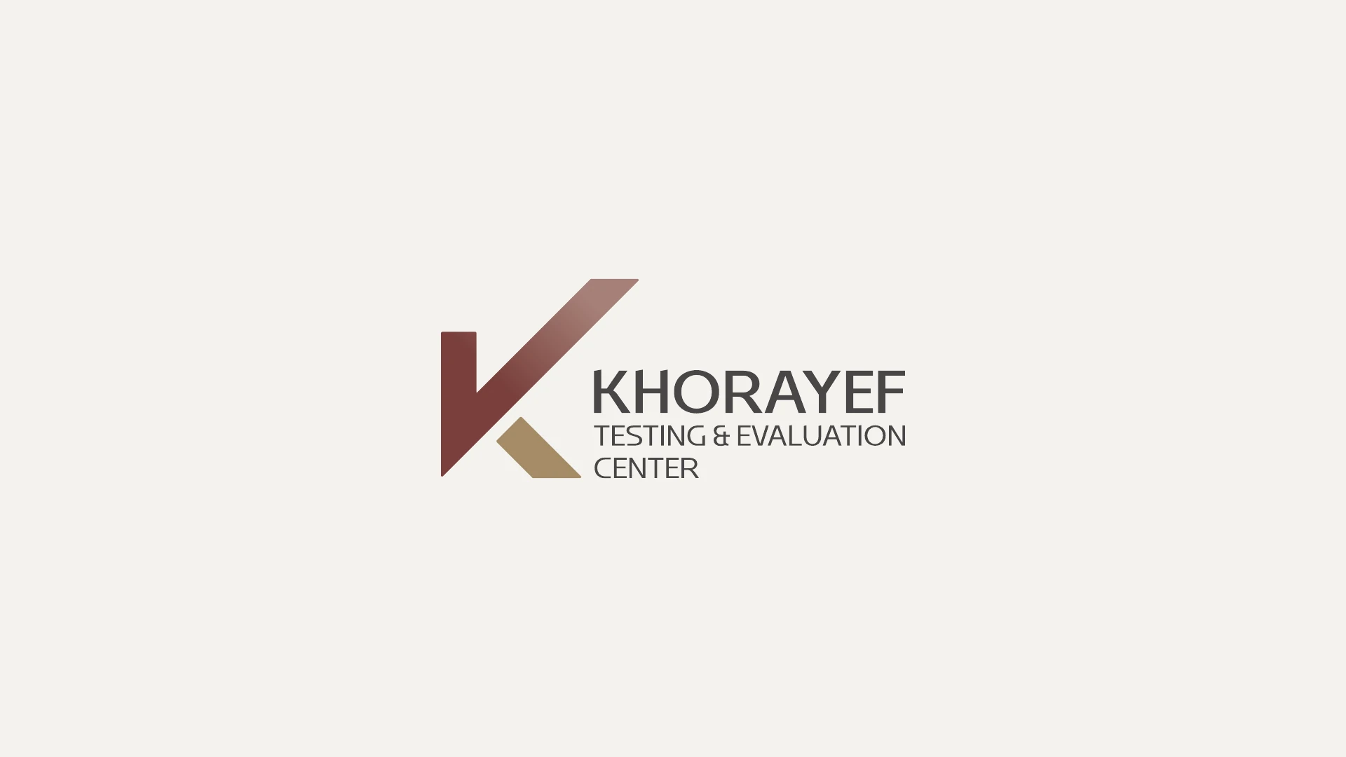
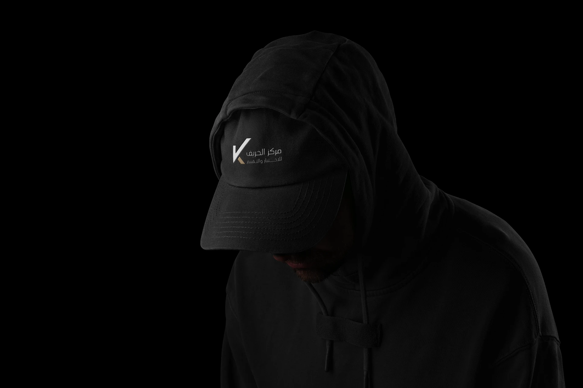
The system moves between the KTEC acronym and fuller Arabic and English signatures. The symbol remains the constant; the naming adapts to the communication context.
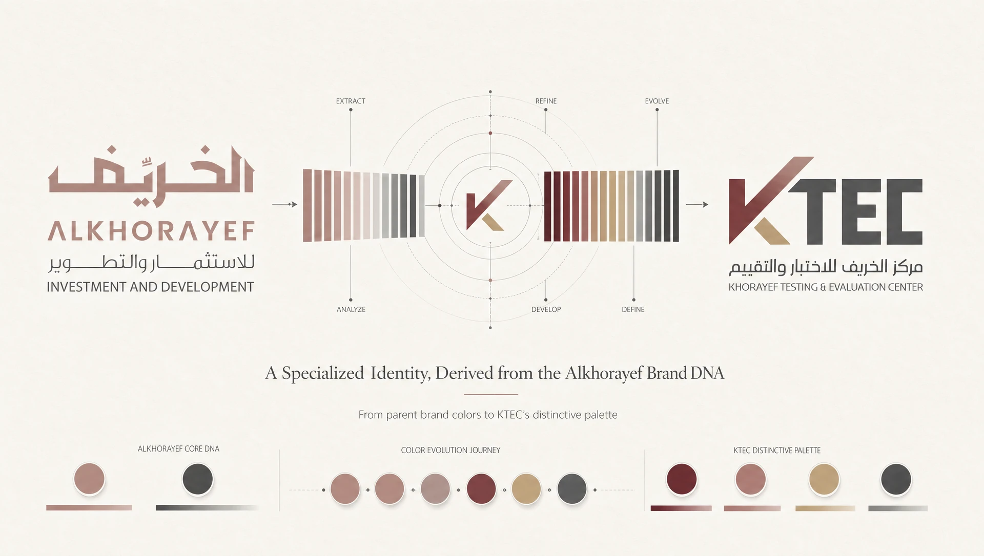
The muted rose and charcoal establish continuity with Alkhorayef. Burgundy gives KTEC a deeper focal point, while sand gold introduces a restrained accent. The result feels related without simply reproducing the parent identity.
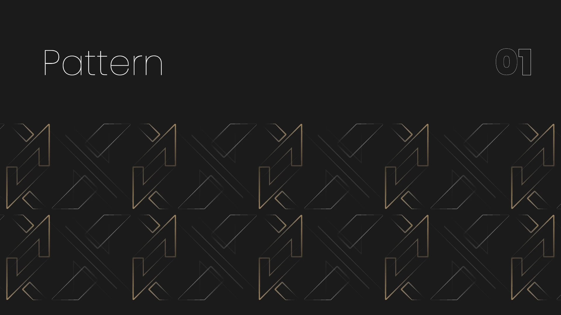
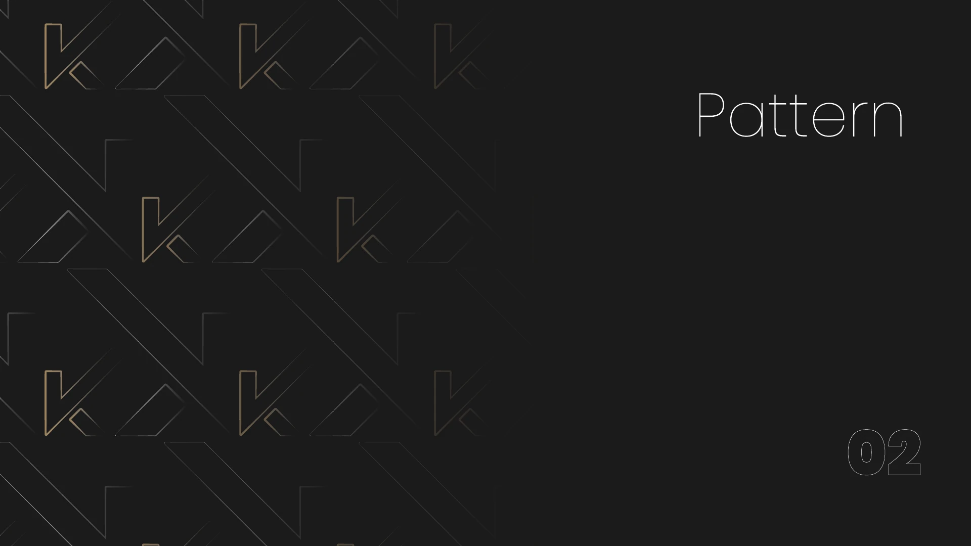
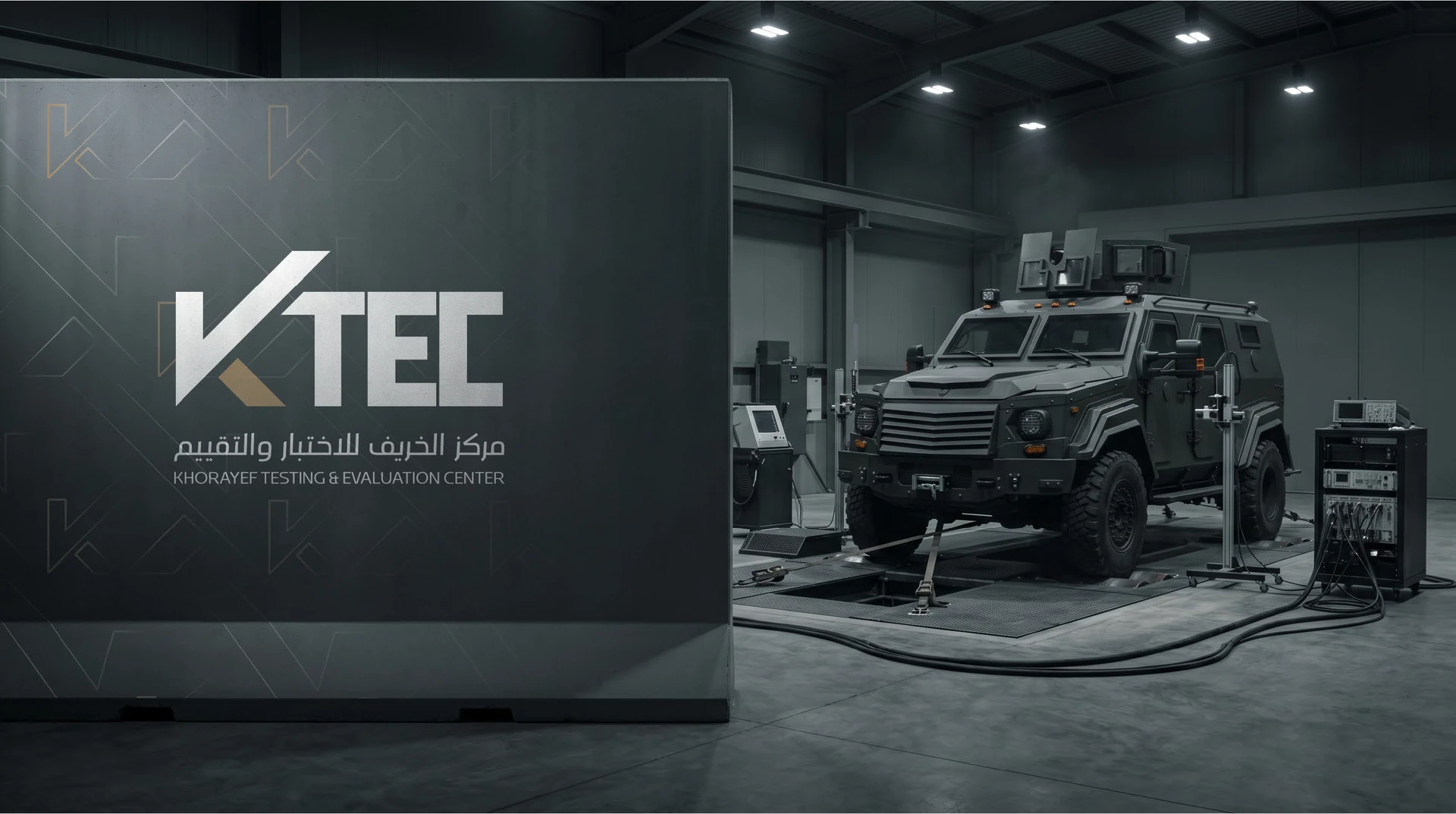
Repeating the K extends its diagonal rhythm into a pattern. It gives larger surfaces a recognizable texture while the main signature stays clear and uncluttered.
10 application mockups
From signature to sense of place.
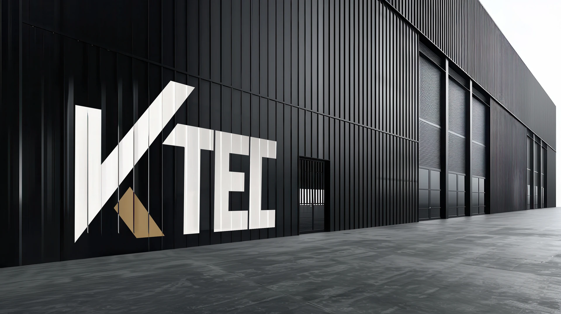
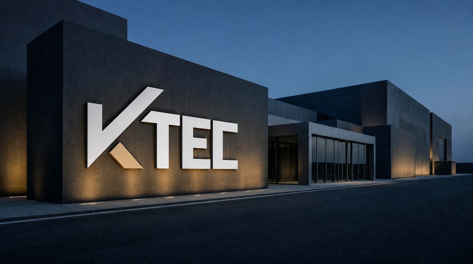
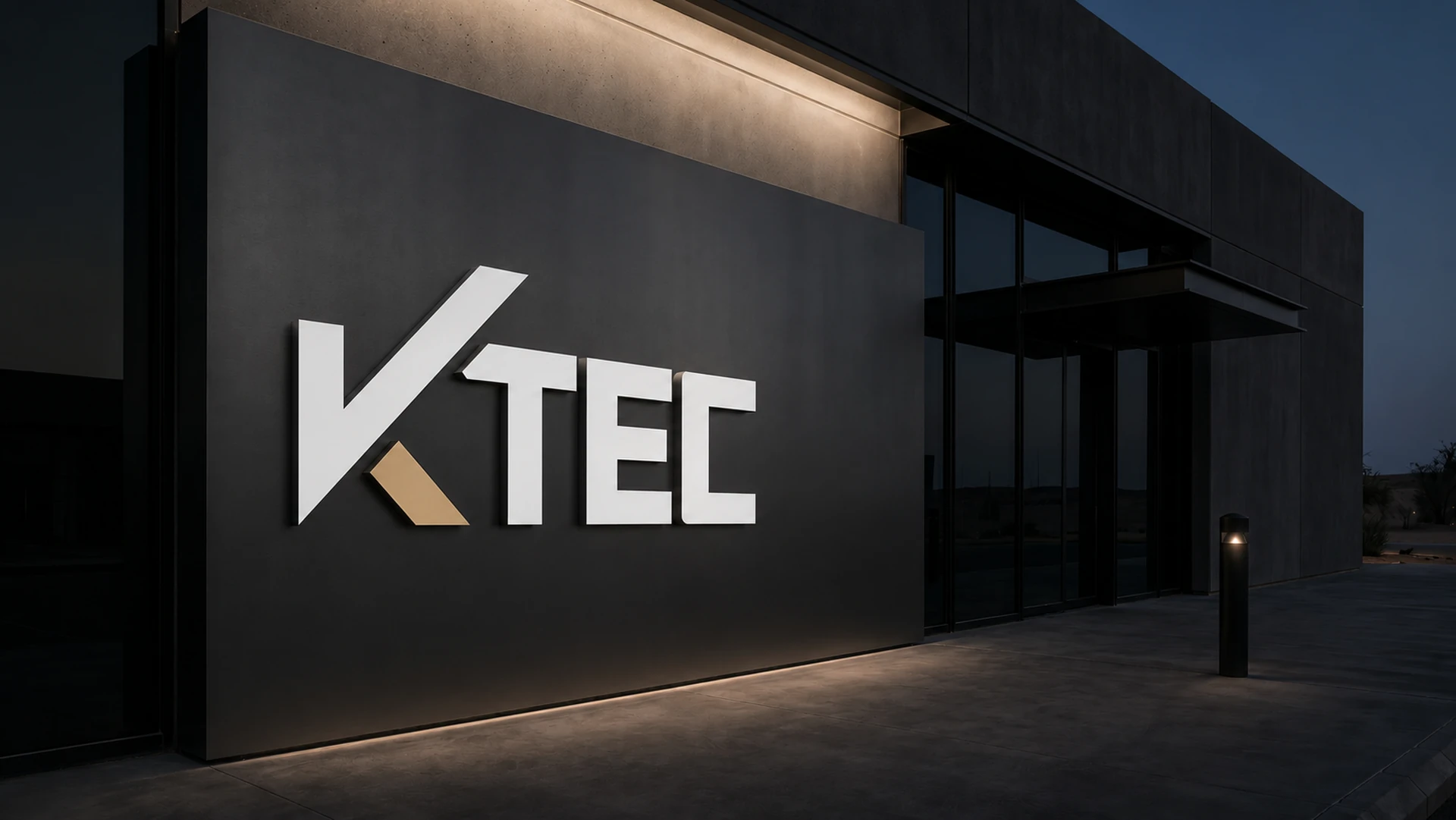
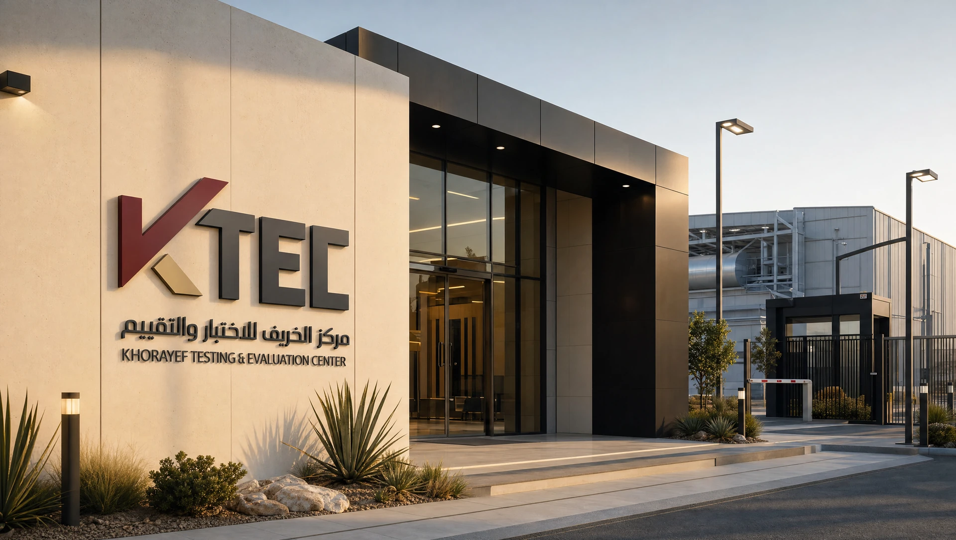
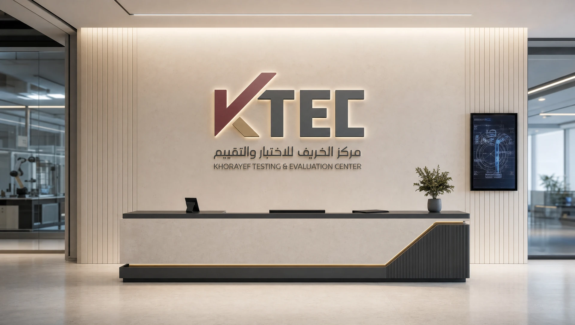
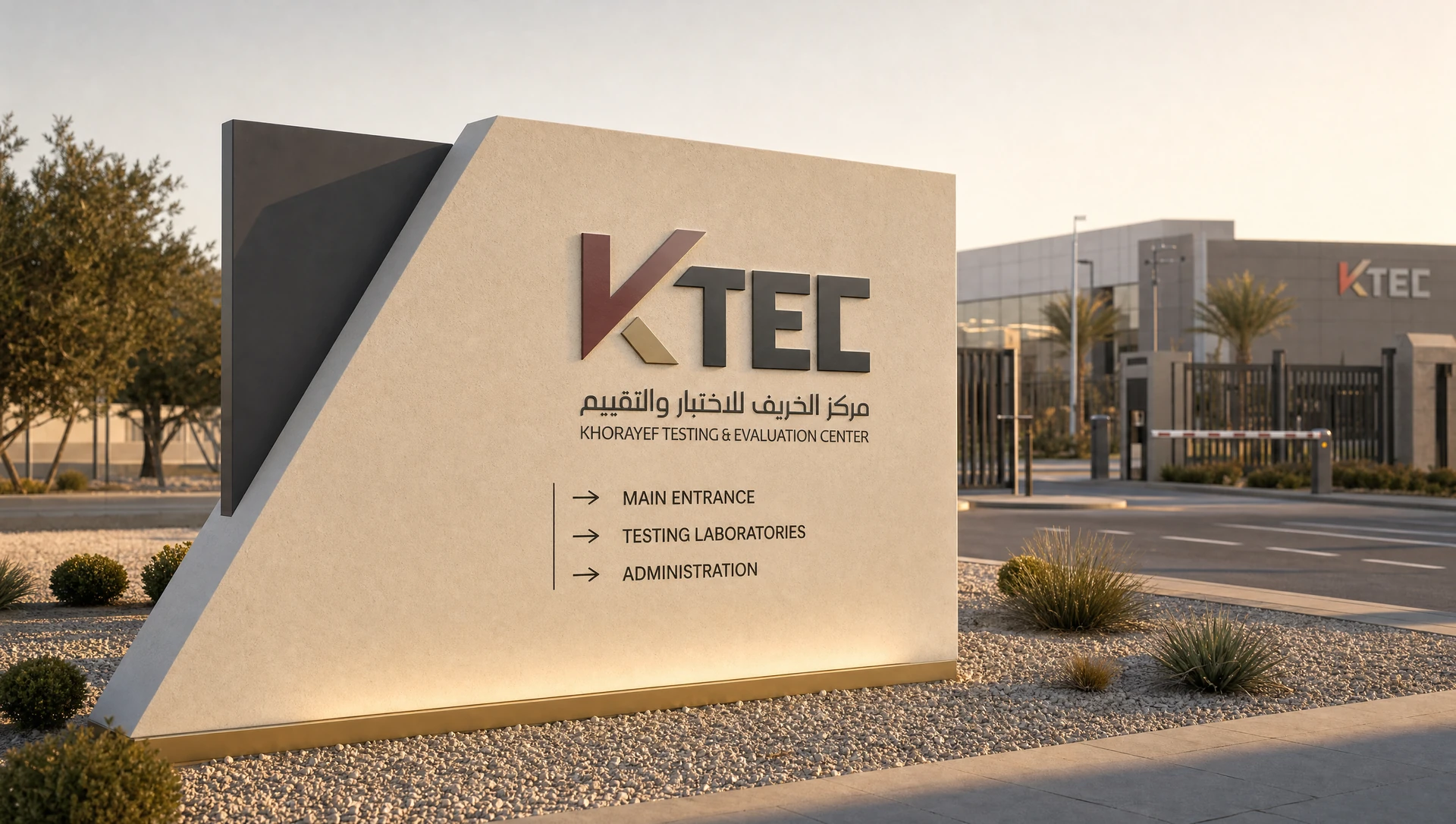
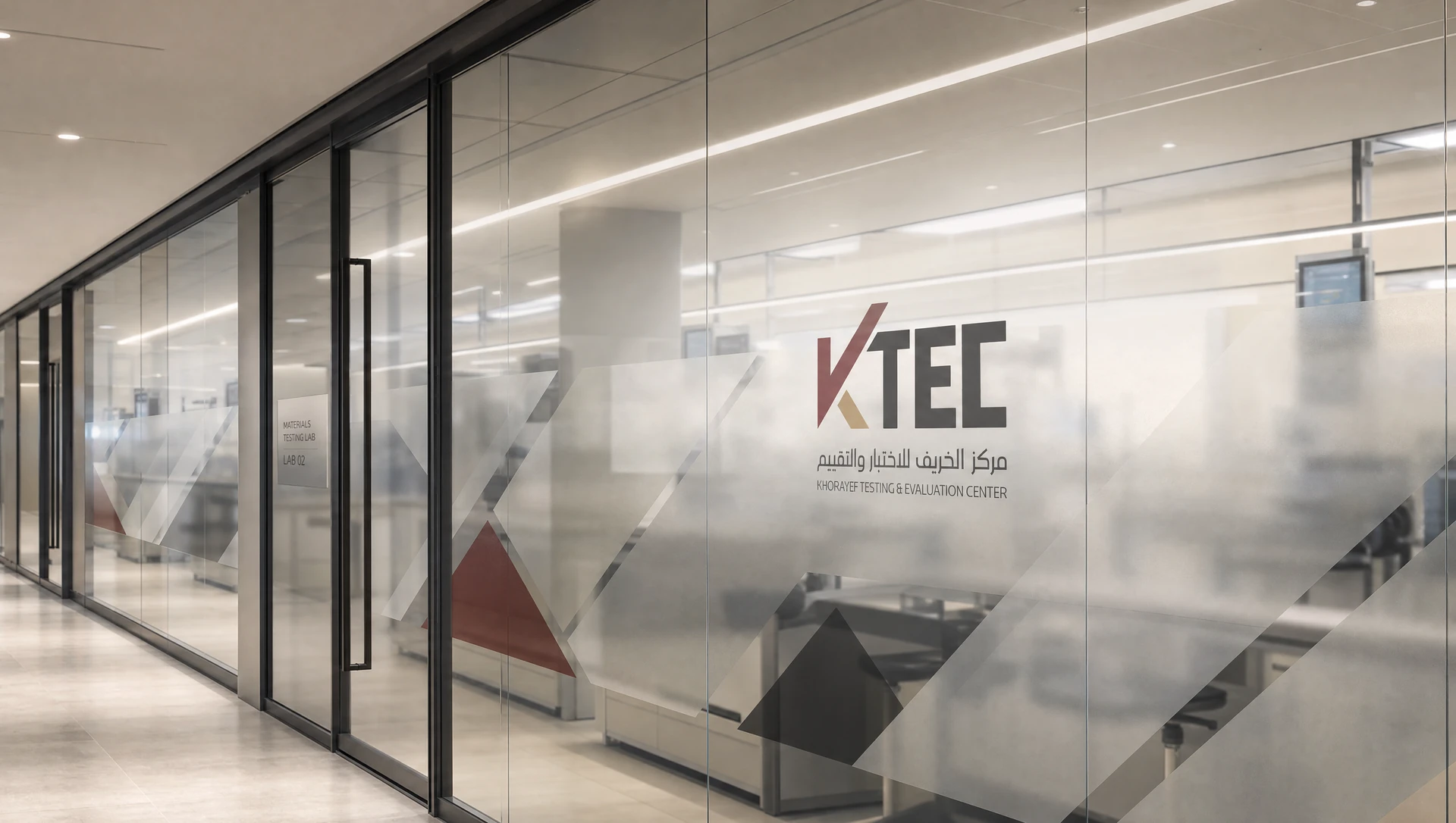
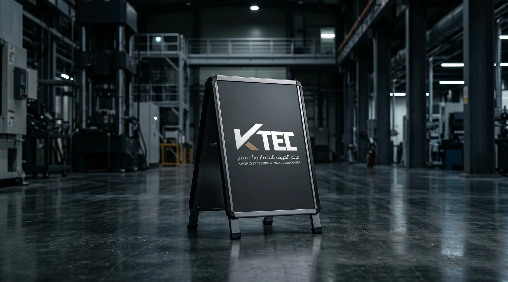
Facade lettering, reception, wayfinding and glazing test the identity against architecture. The same mark has to hold a distant view and feel considered at close range.
Swipe or use the arrows. Select an image to enlarge.
6 application mockups
A working identity, at human scale.
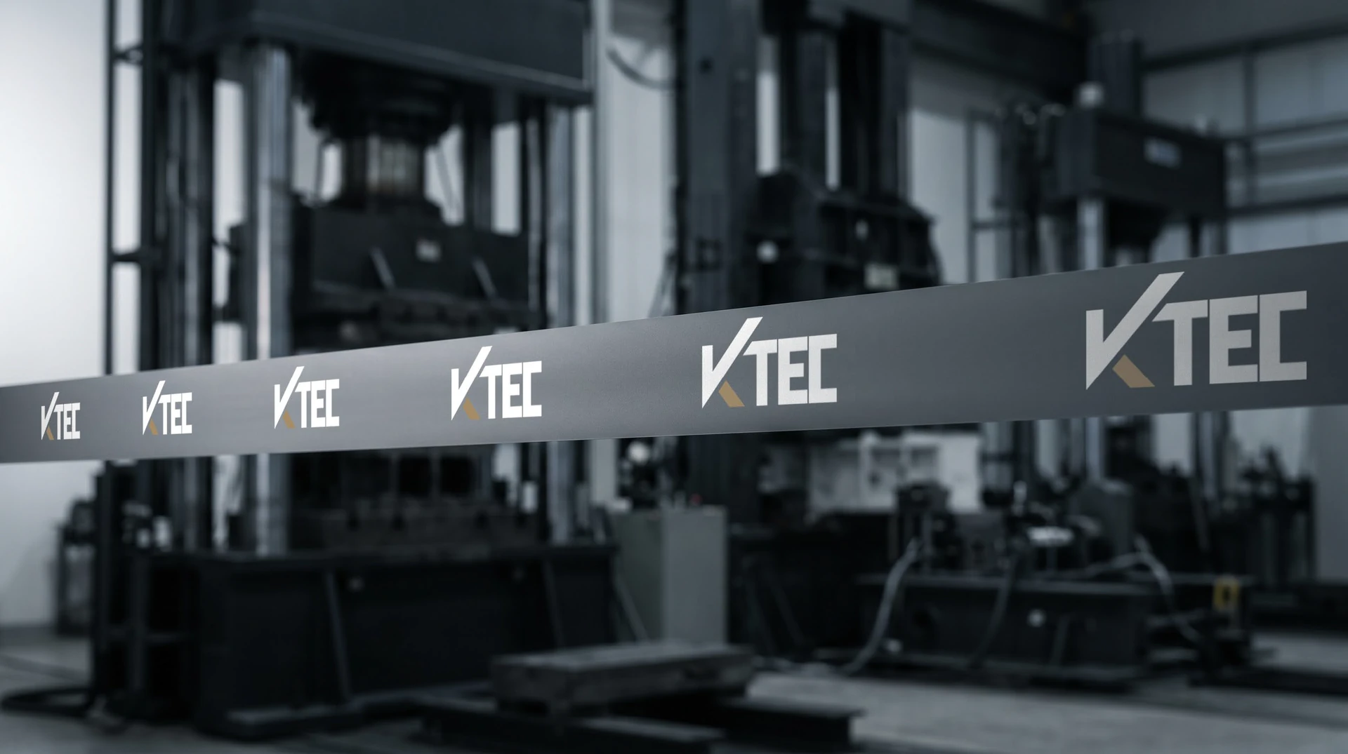
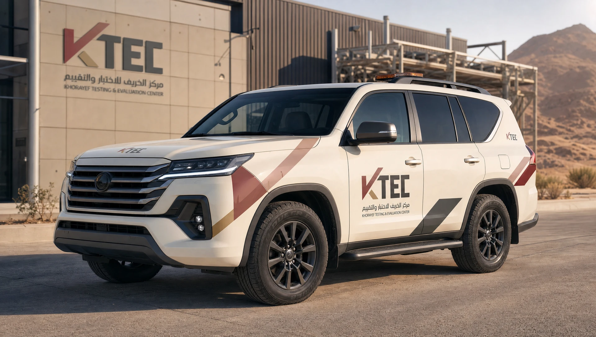
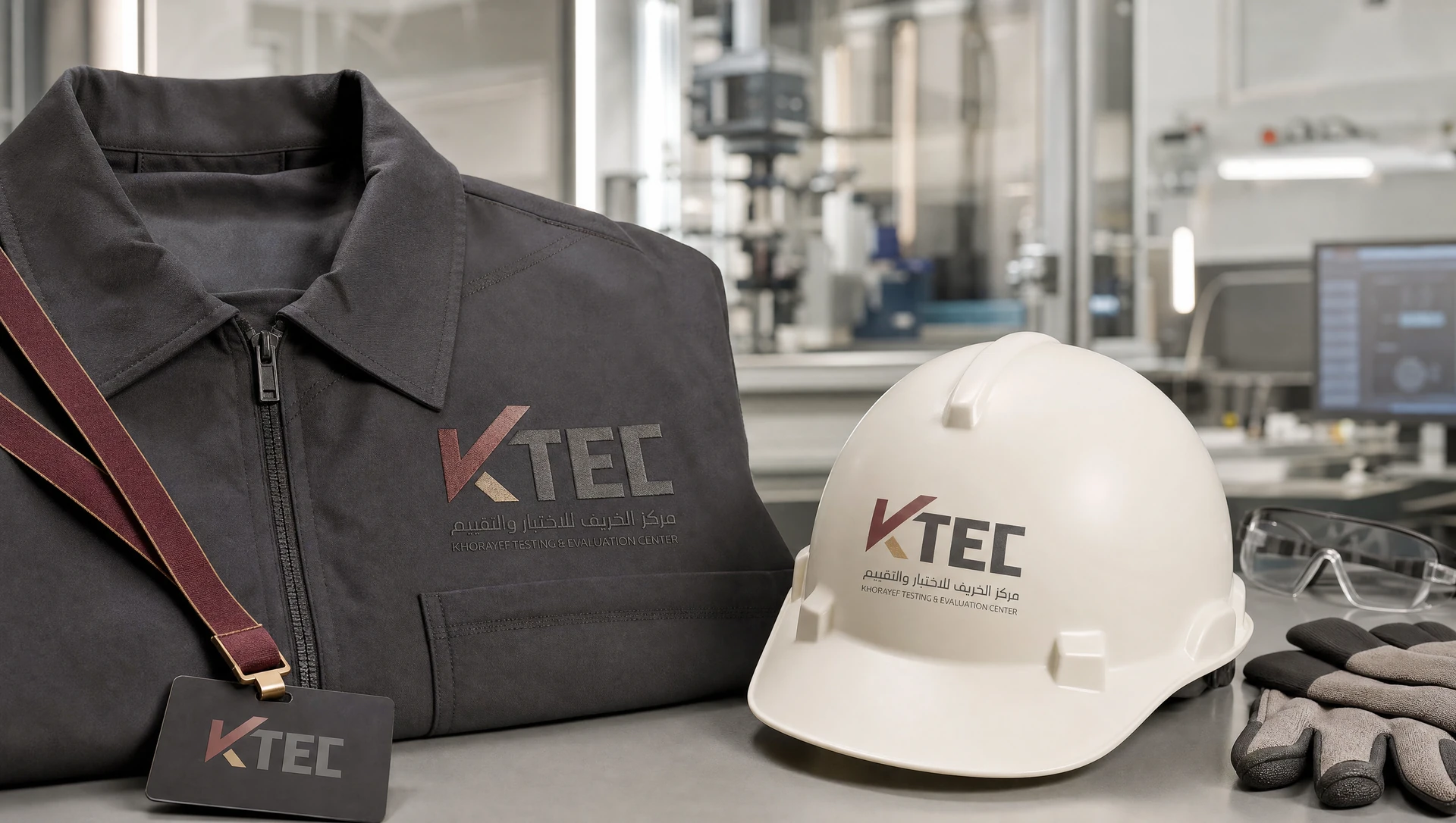
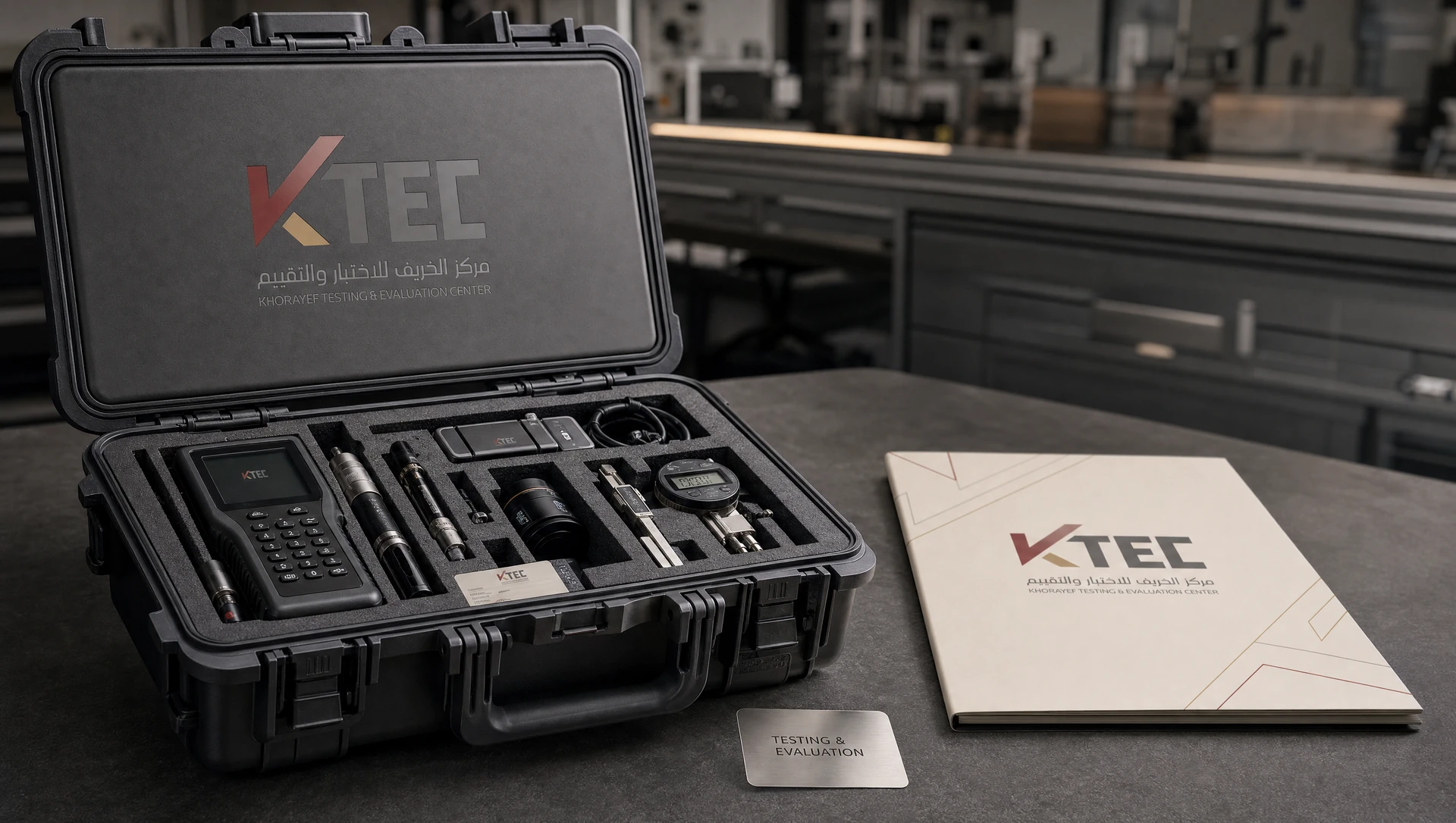
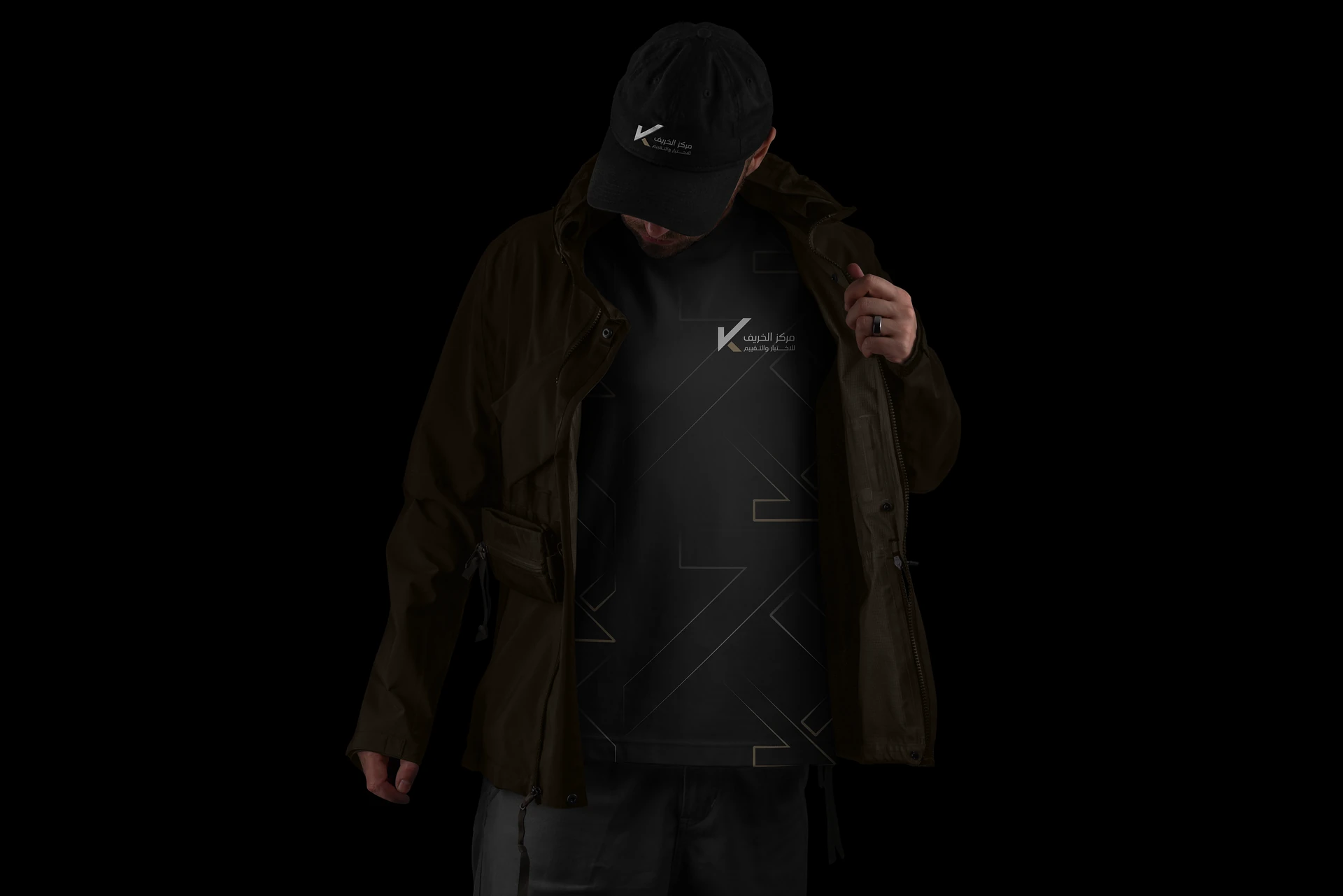
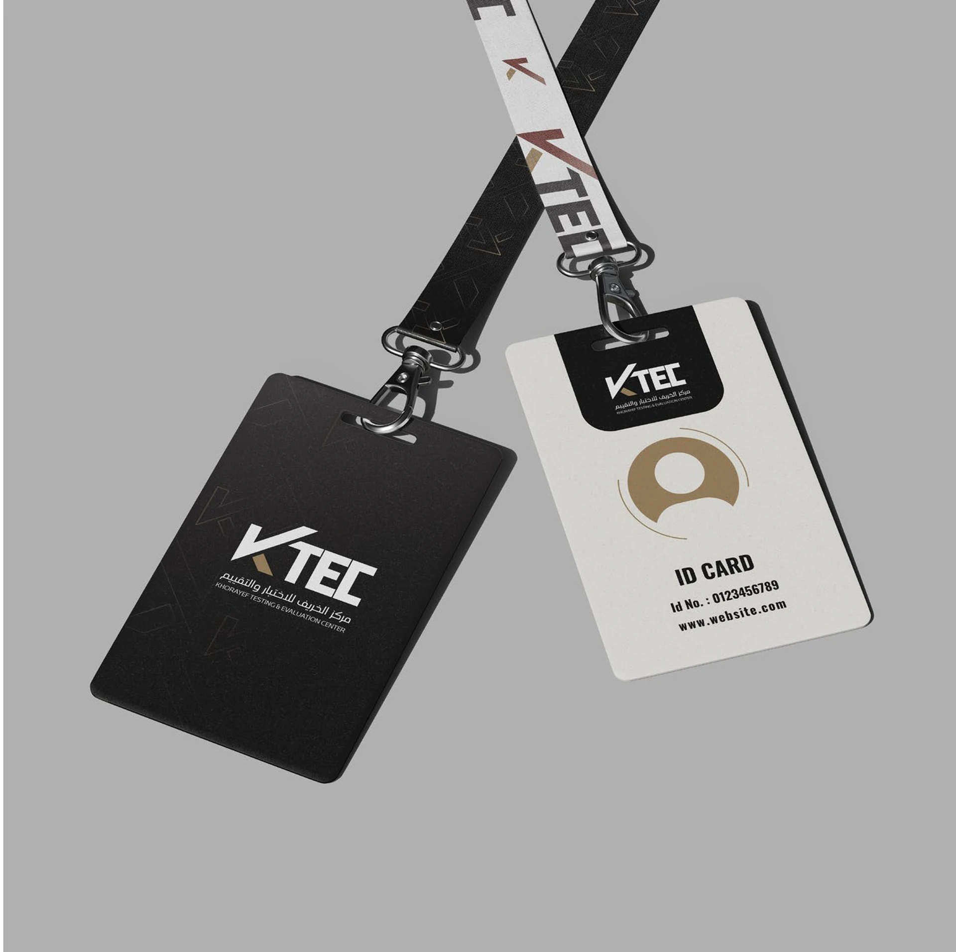
Livery, workwear, equipment and identification move the system onto practical surfaces. Restrained placement lets the mark stay legible without competing with the object’s purpose.
Swipe or use the arrows. Select an image to enlarge.
7 application mockups
The quiet side of the system.
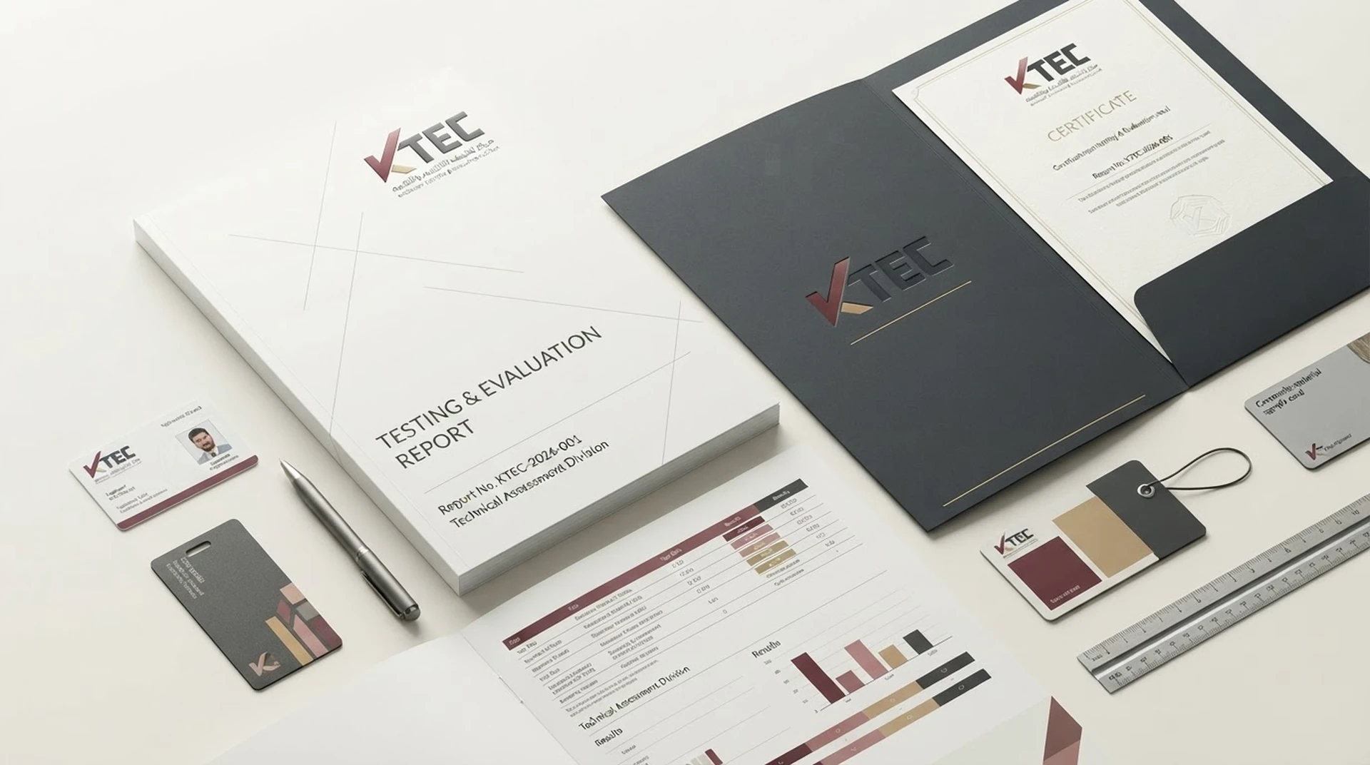
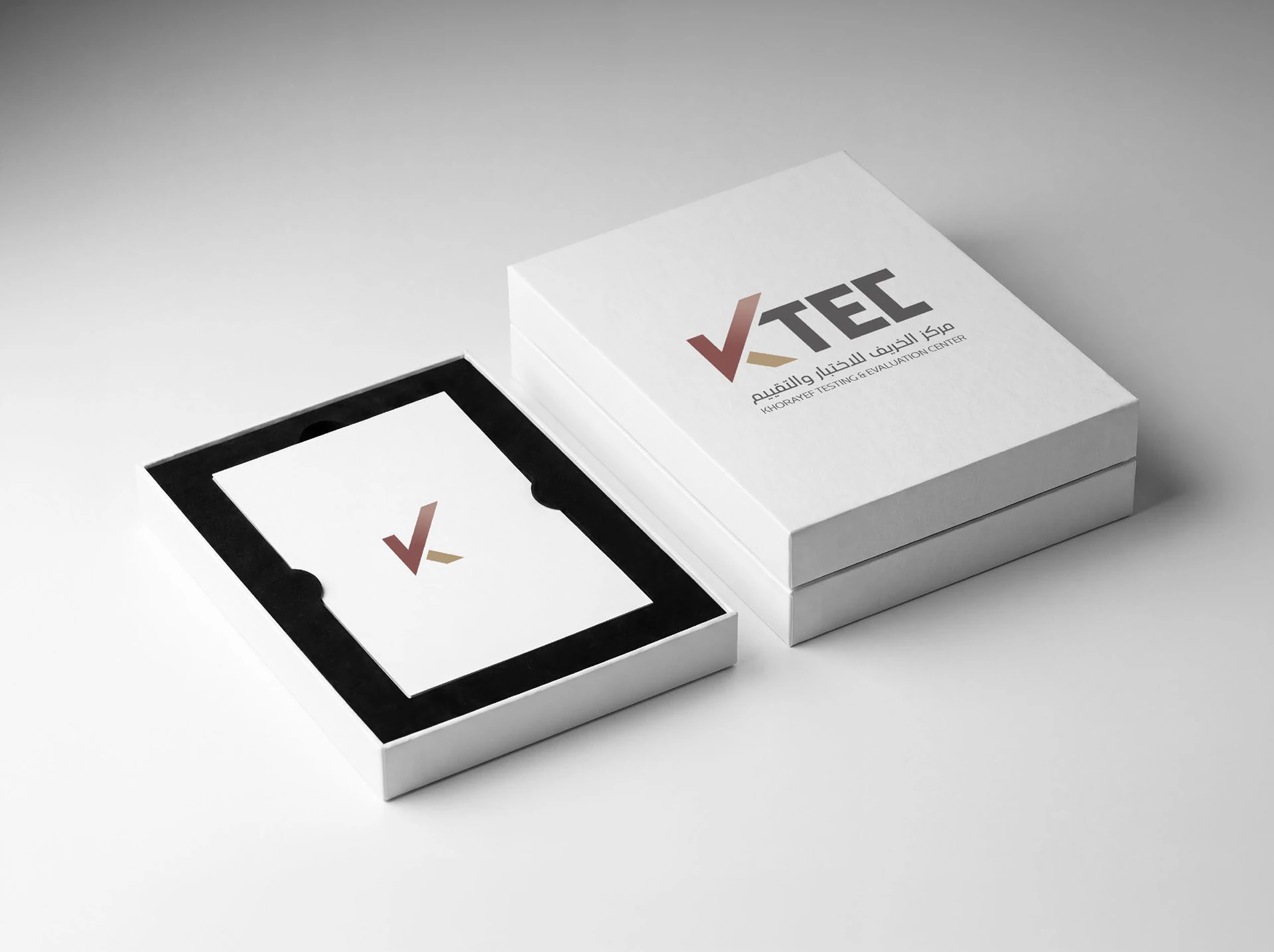
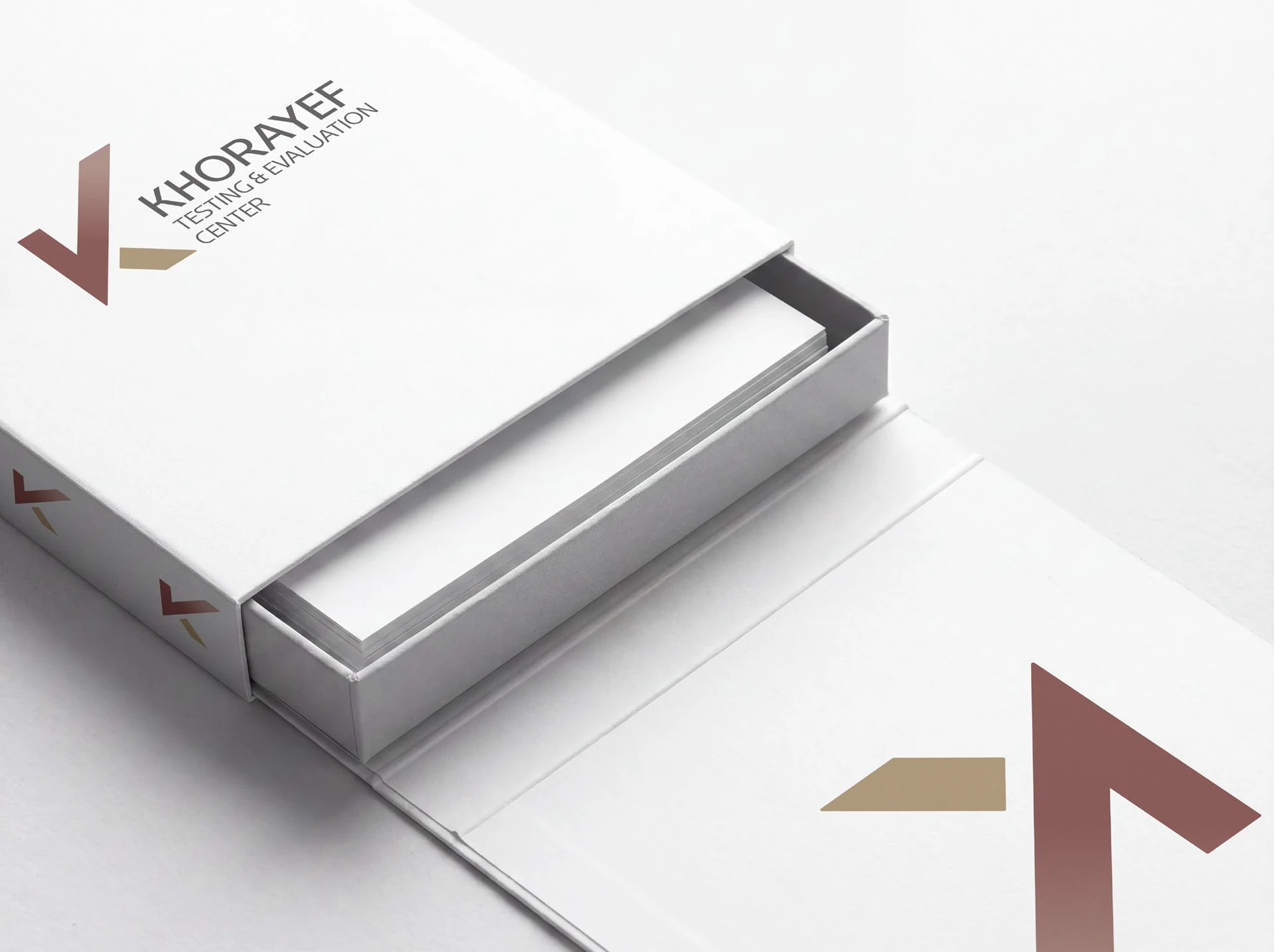
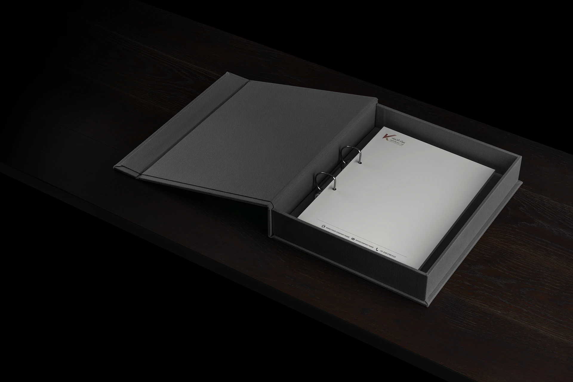
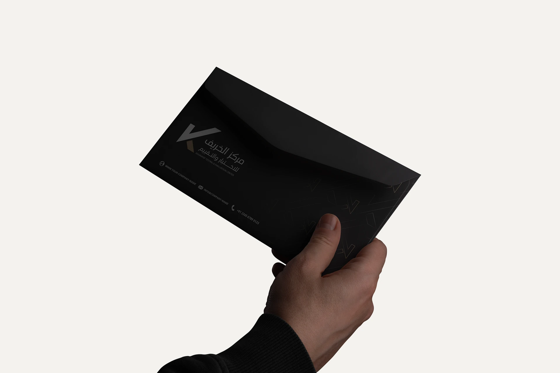
Reports, folders, cards and packaging give the identity a more tactile expression. Light and dark treatments show how the same visual language can support formal documentation and presentation.
Swipe or use the arrows. Select an image to enlarge.
3 application mockups
Continuity across screens.
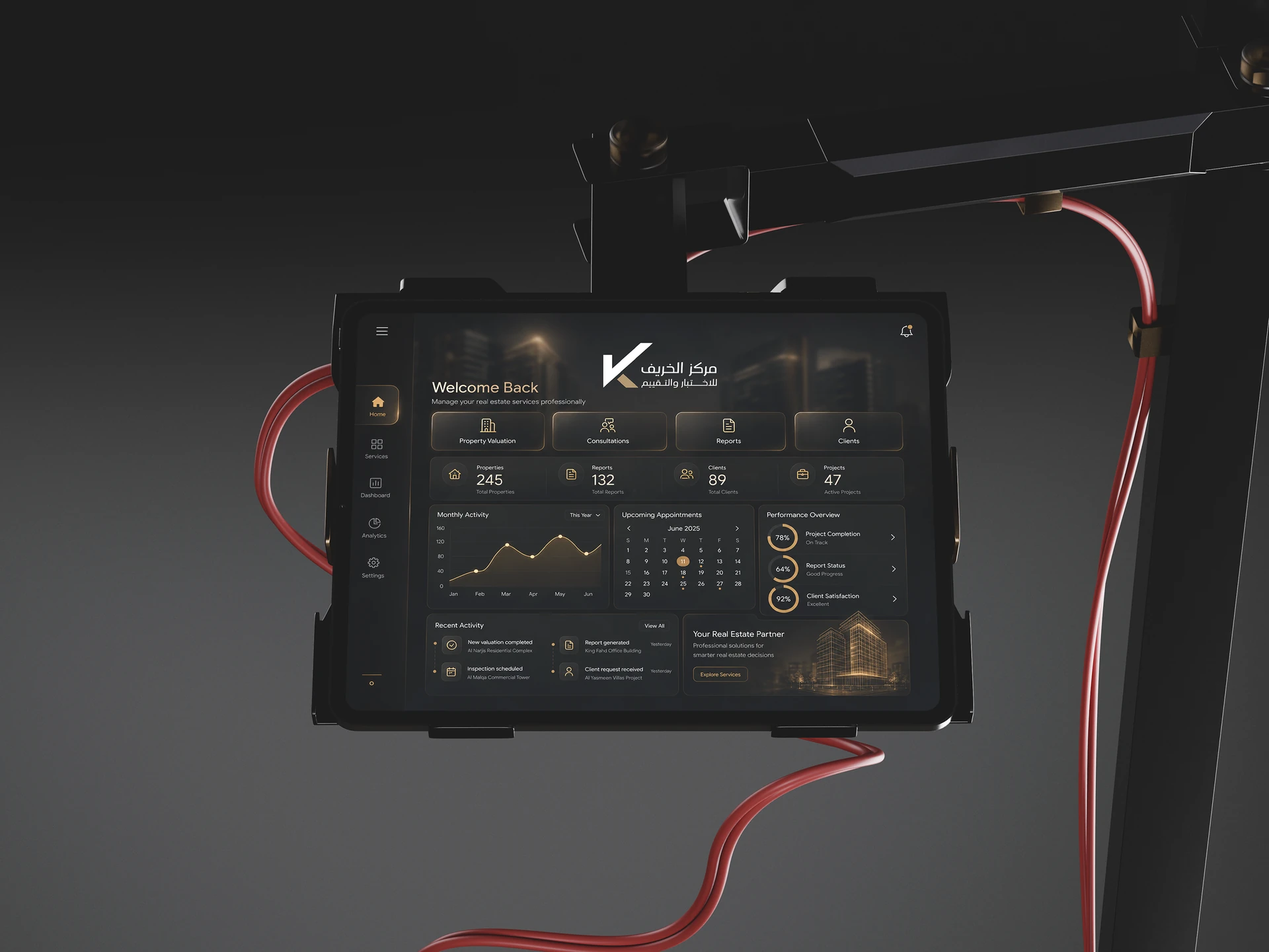
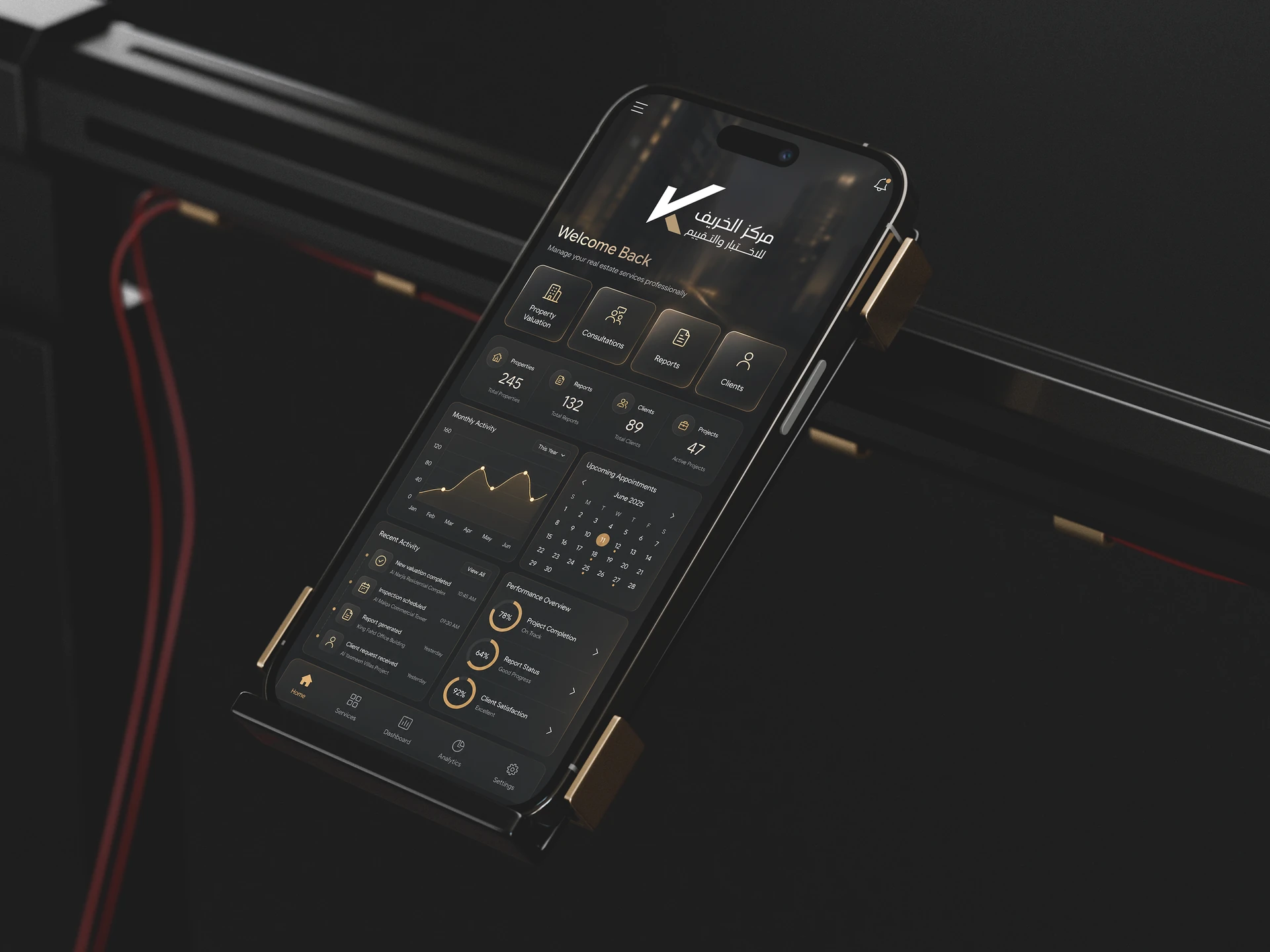
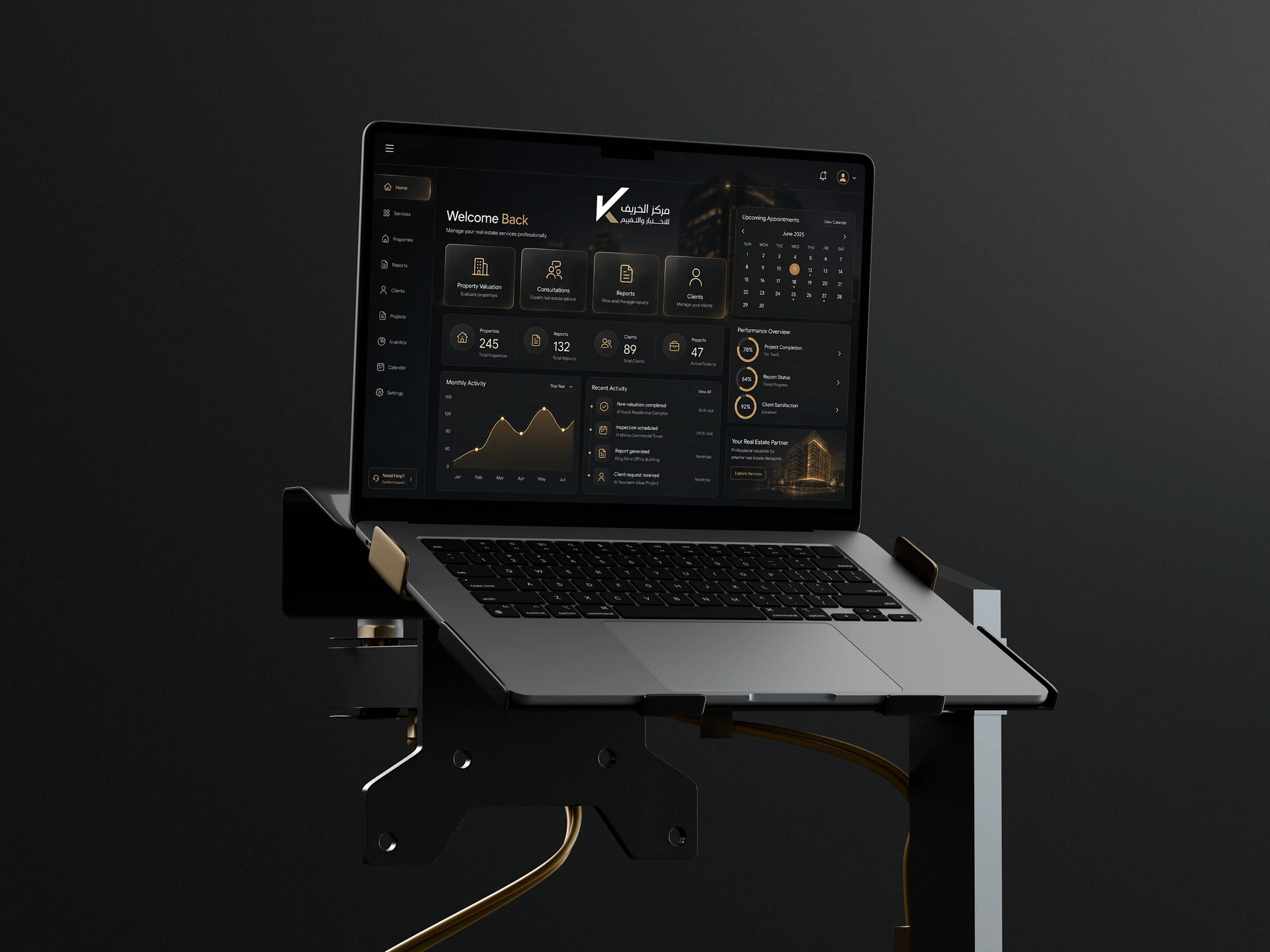
Laptop, tablet and phone mockups explore how the brand could live within a technical interface. They illustrate identity consistency across devices, rather than a finished software product.
Swipe or use the arrows. Select an image to enlarge.
The design exploration
Each route asks a different question: should the identity lead with direction, verification, analysis, protection or focus? The original concepts are shown alongside the reasoning and tradeoff behind each proposition.
The approved artwork is presented above. These are the exploration materials, including the early verification concept that shares its central idea with the final mark.
Explored route 01 / alternative
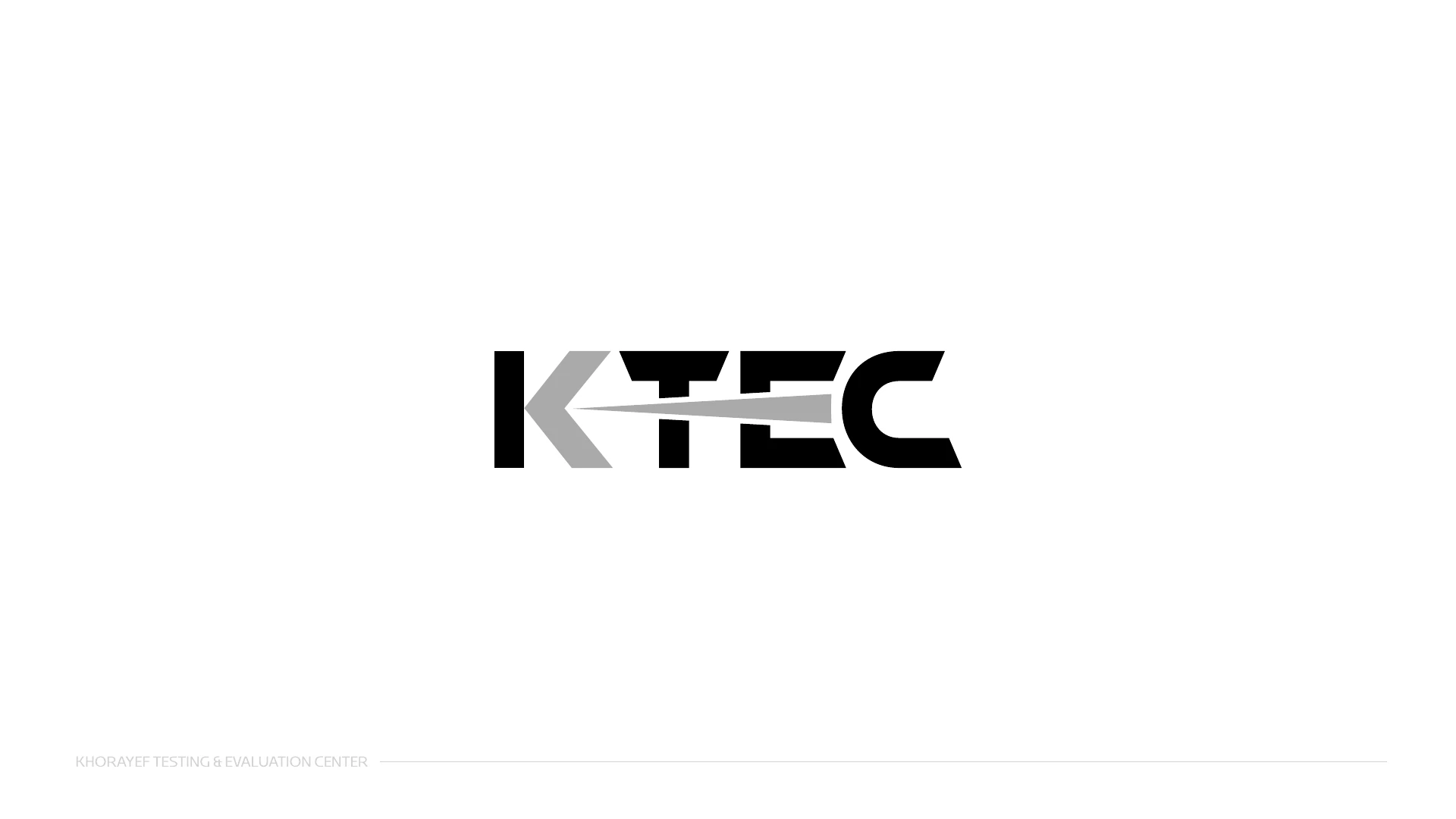
Precision as a directed action.
An arrow cuts through the letterforms, connecting the wordmark to the idea of a measured path. It gives the testing context an immediate, forceful visual cue.
It makes direction and accuracy visible at first glance.
The projectile reference is specific and energetic. It places more emphasis on the test action than on the broader role of evaluation.
Explored route 02 / idea retained and refined
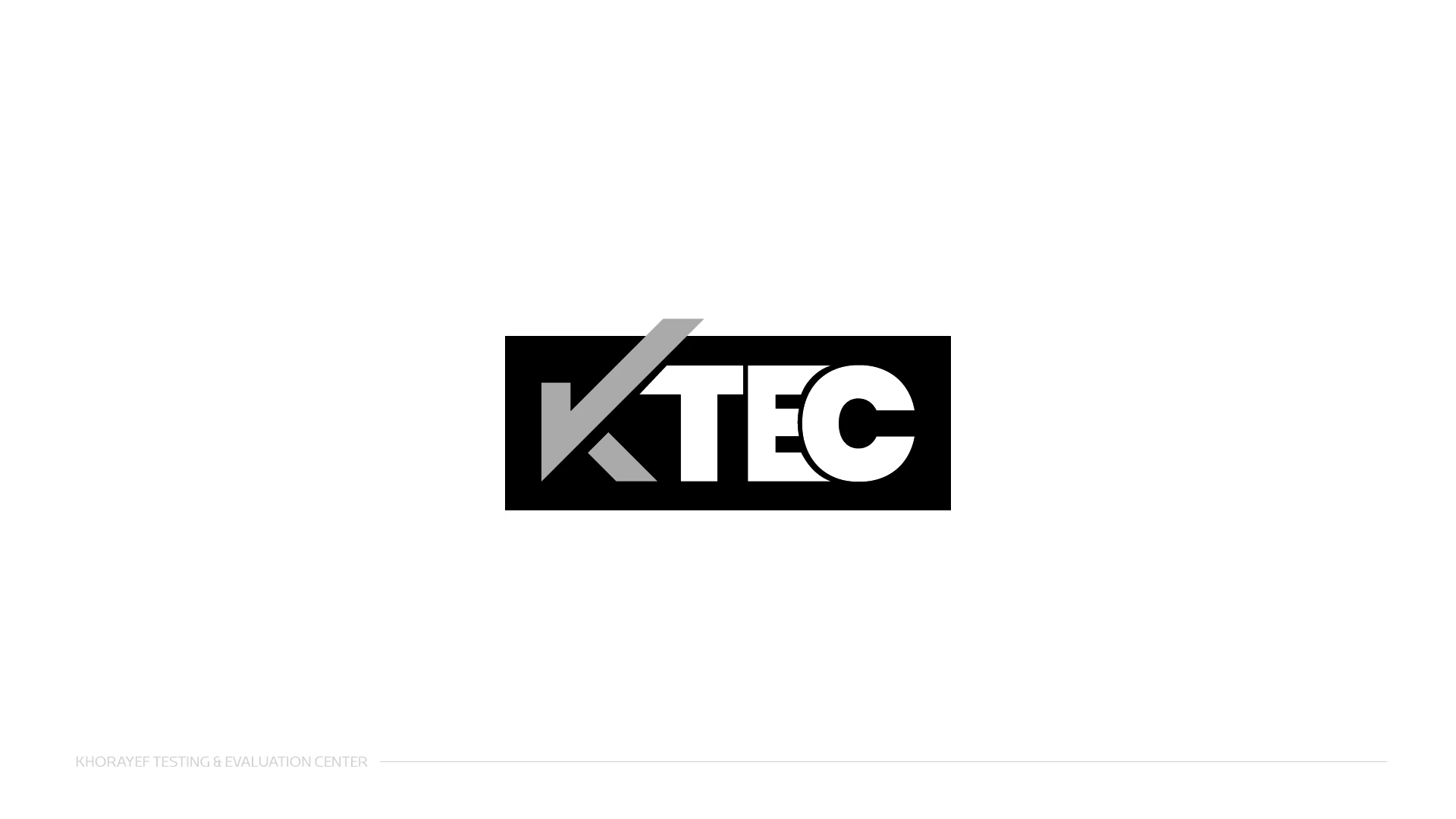
The result becomes the symbol.
A check is integrated with the K, giving the name a direct link to evaluation. The original exploration places the mark inside a dark frame, with gold providing the point of emphasis.
The check-shaped initial is the clearest conceptual connection. In the approved artwork, it becomes a more open signature with a palette aligned to the parent brand.
Removing the enclosing frame lets the symbol and wordmark occupy a wider range of settings. The idea remains direct while the final identity gains more flexibility.
Explored route 03 / alternative
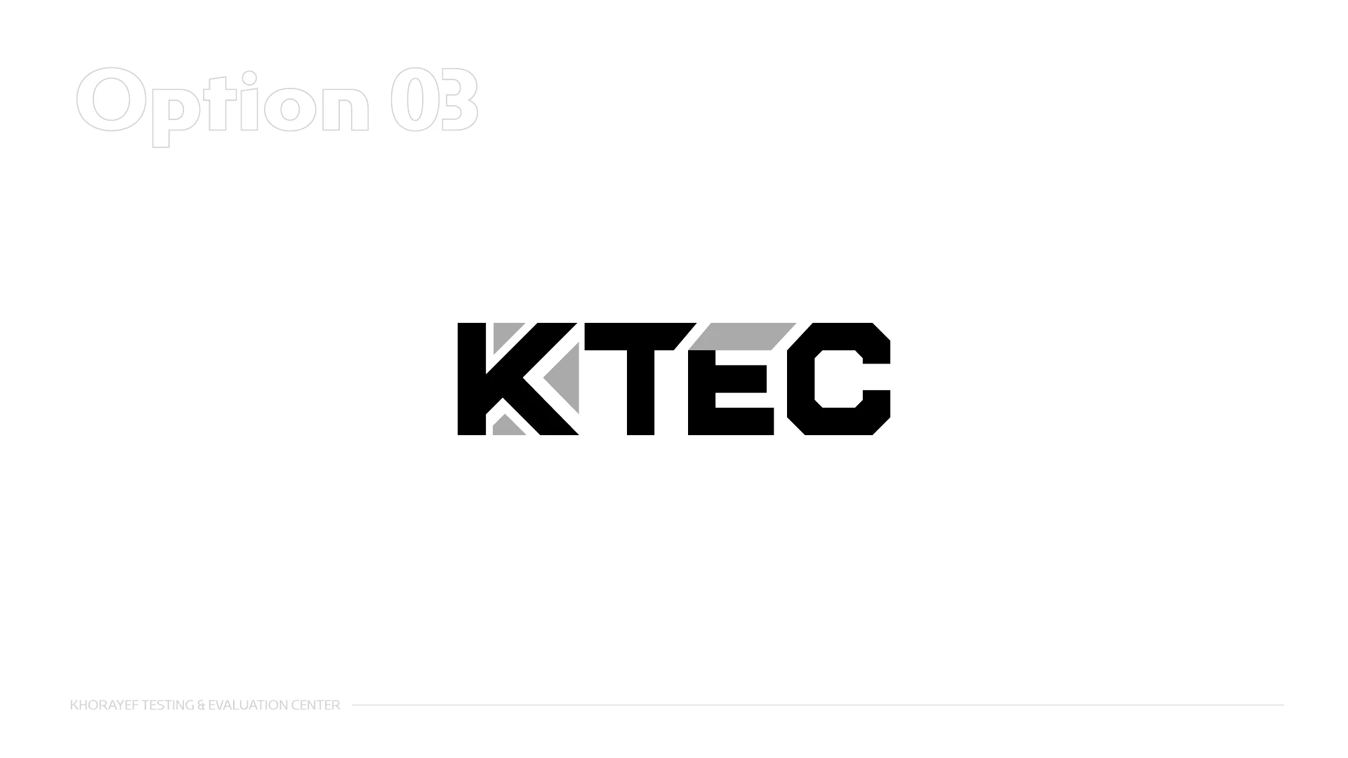
Understanding, piece by piece.
Segmented letterforms suggest an object examined in parts and brought back together. The concept shifts attention from an immediate result to the analytical thinking behind it.
Its modular construction gives the testing process a distinctive graphic language and a strong relationship to technical imagery.
The cuts create character, but they also ask the viewer to assemble the word visually. The approved route places the message in a simpler initial.
Explored route 04 / alternative
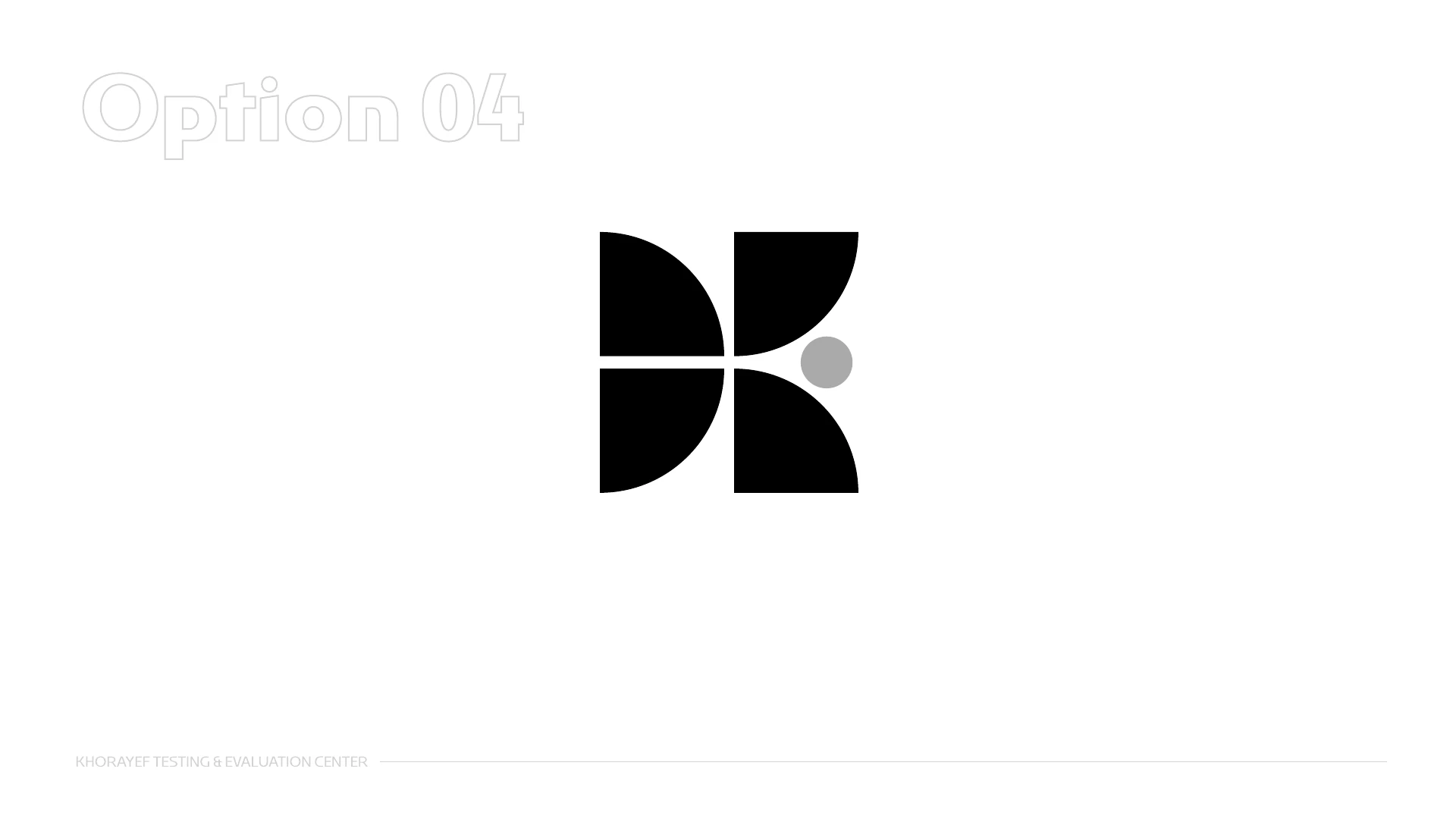
Confidence held around a centre.
Four curved components meet around a central point to suggest a K. The presentation connects that arrangement with protection, balance and the integrity of a tested whole.
It offers a compact emblem with a softer silhouette. The central space becomes as important as the surrounding parts.
Protection is an evocative association, but the meaning depends more on explanation. The approved mark connects more directly with both the name and verification.
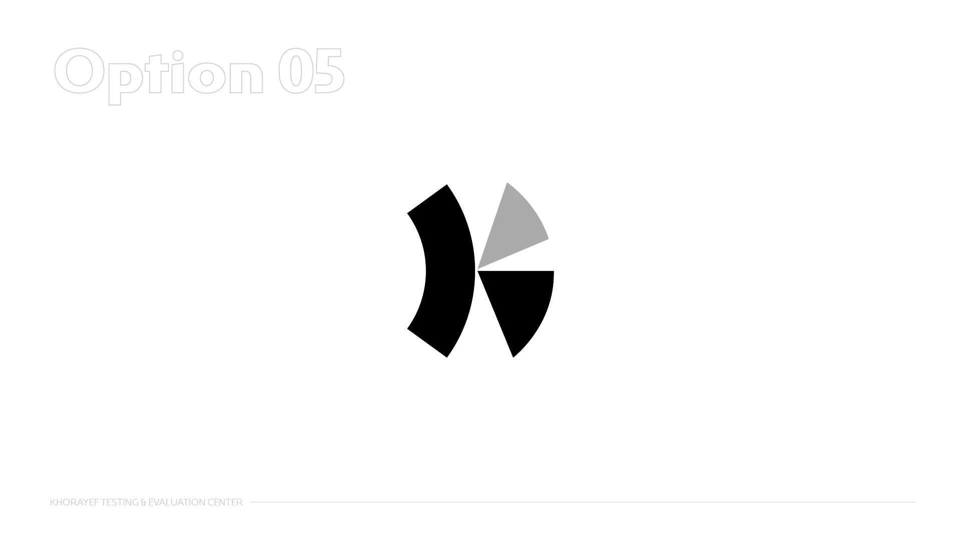
Explored route 05 / alternative
Many observations. One focal point.
Curved and angular parts converge on a shared centre. The concept turns concentration and controlled observation into a compact abstract symbol.
The tension between the broad curve and the sharp wedge gives the symbol a distinctive sense of direction.
Its abstraction creates interpretive range, but the relationship with the KTEC name is less immediate. The approved route gives the initial a more explicit role.
The directions, side by side
The approved identity offers the most balanced response to the brief: a recognizable name, a direct idea of verification and a clear family resemblance.
Approved
Strength
Name, verification and belonging.
Why it fits
The check-shaped K, open wordmark and parent-brand palette bring the strongest ideas into one adaptable signature.
Alternative
Strength
Immediate direction and energy.
The distinction
A forceful testing cue, but the projectile reference places more emphasis on a specific test action.
Idea retained
Strength
The clearest link to evaluation.
The distinction
The core idea carries forward. The approved version opens the frame and connects the palette to the parent brand.
Alternative
Strength
A distinctive language of parts.
The distinction
The modular cuts express analytical thinking, but require more visual assembly when reading the name.
Alternative
Strength
A compact emblem of assurance.
The distinction
The balanced form suggests protection, while its connection to the name and verification needs more explanation.
A comparison of the visual decisions shown in the project. Select any mark to inspect its original artwork.
The design outcome
The K is the point of recognition. Its check-like movement introduces the idea of verification without adding a separate icon.
The parent palette provides a starting point. Burgundy, sand gold and charcoal give the specialist identity its own depth and restraint.
Bilingual signatures, repeat patterns and applications demonstrate how one idea can remain coherent across scale, language and material.
The outcome shown here is the approved identity and its application concepts. The study evaluates creative decisions through the design itself; the mockups illustrate the intended visual experience.
The centre in motion
A 2-minute, 19-second visual introduction to the centre’s testing environments.
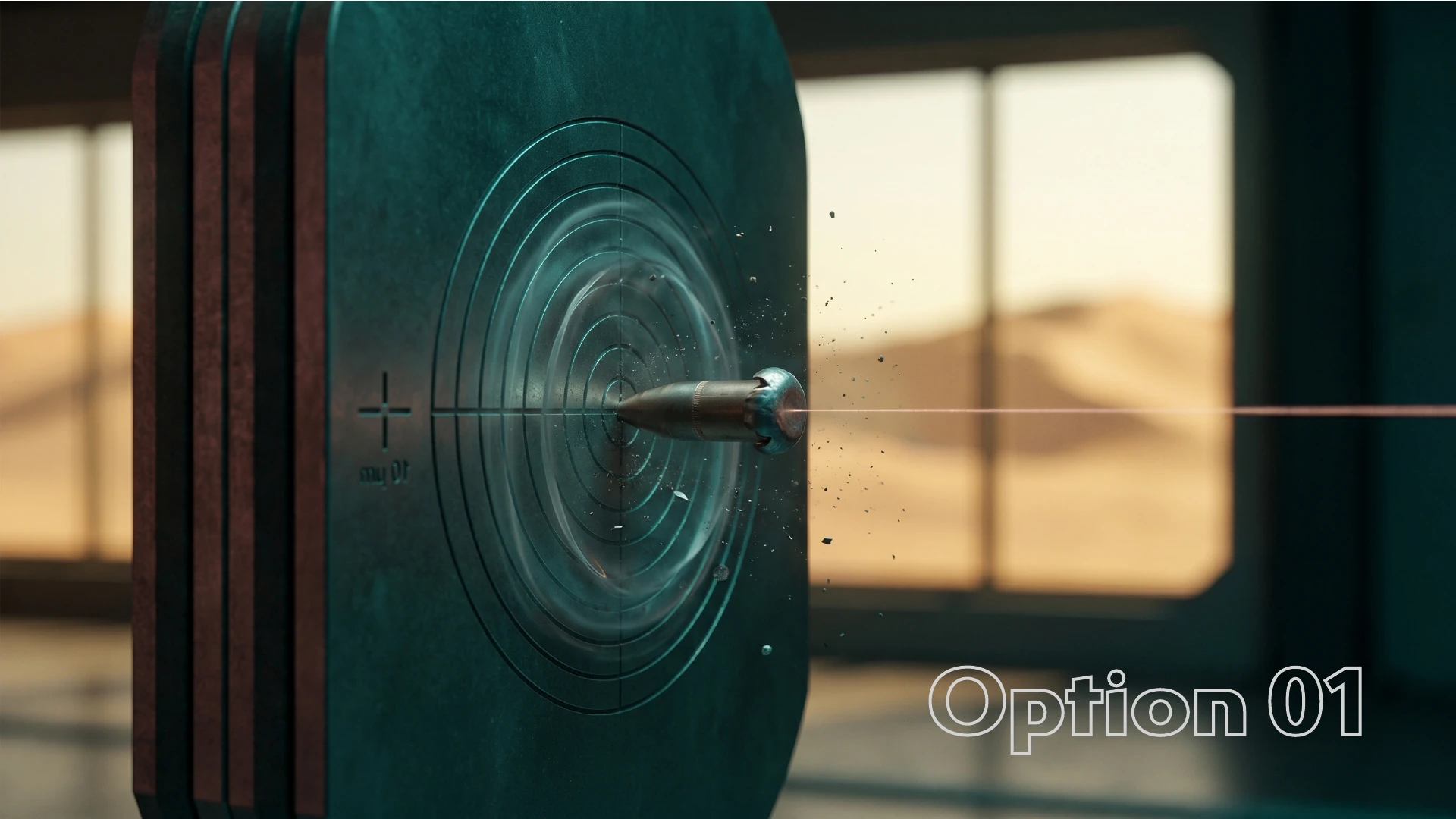
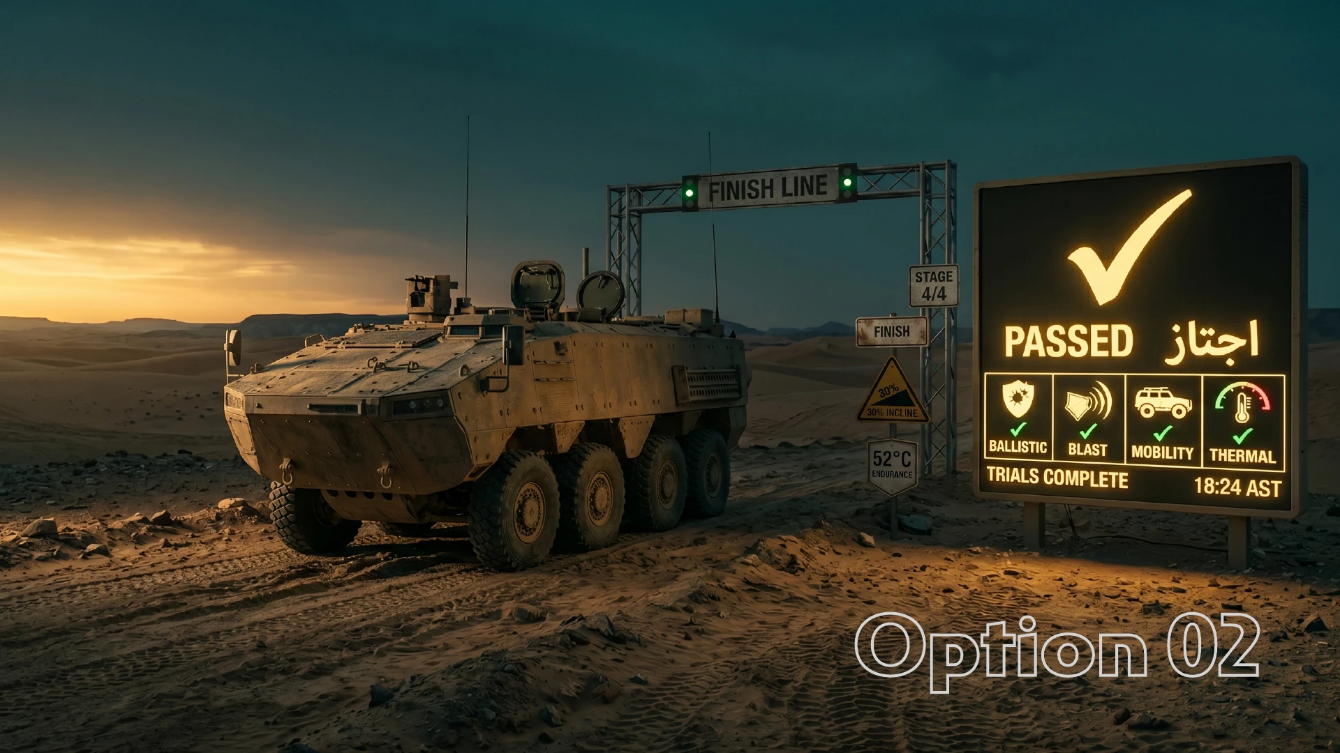
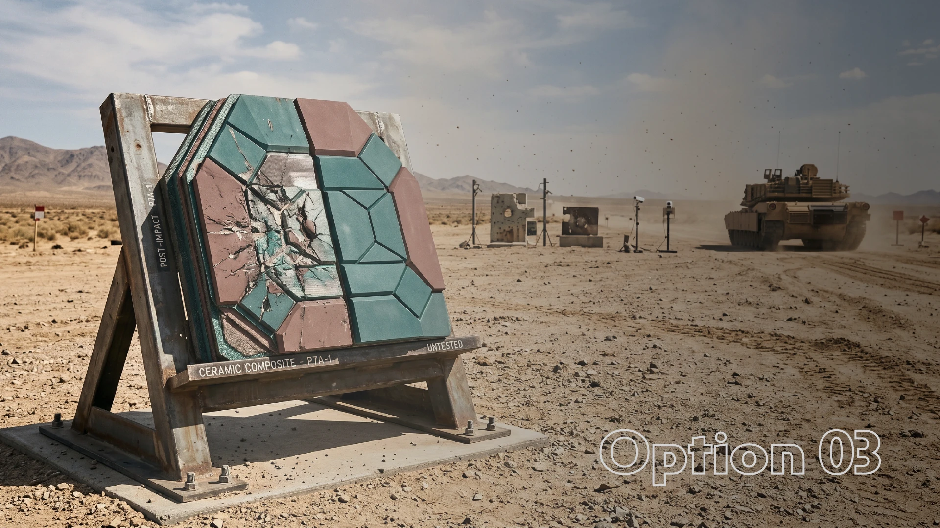
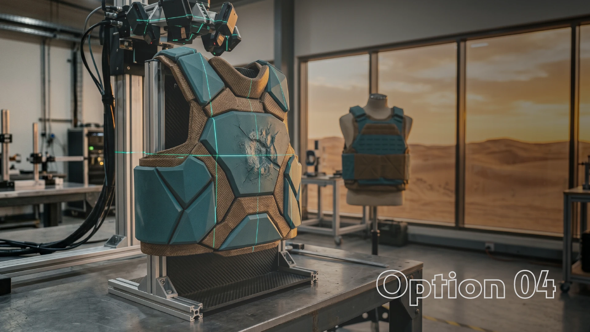
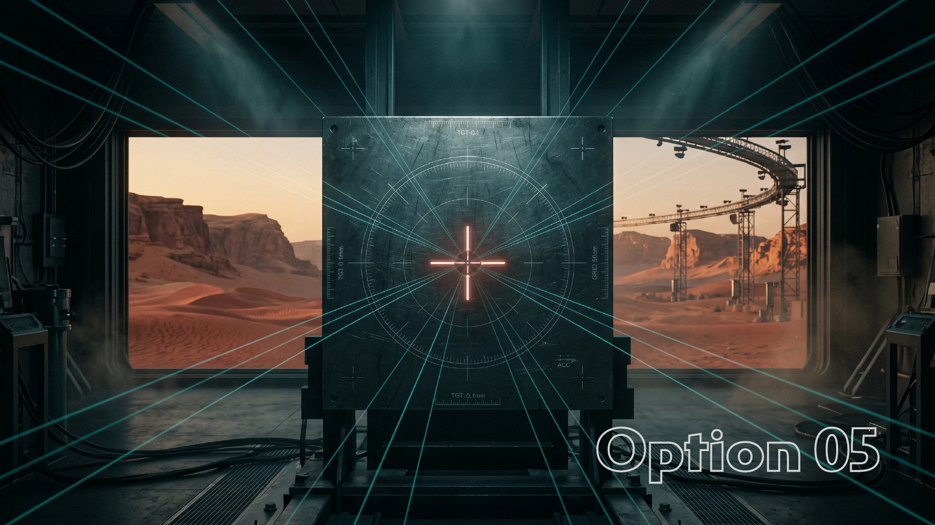
The film expands the context around the identity: a controlled visual rhythm, a restrained palette and large-scale environments that give the signature a place to belong.
Centre visualisation film supplied with the identity project.
Next case study
Turning sponsorship into connection. Two creative directions for Dar Al Qias.